
Color Schemes in TelemetryDeck dashboard
Our first set of selectable color schemes targets people with color vision deficienc

Daniel is TelemetryDeck's co-founder and technical lead
Today we're knocking off another feature request we've gotten a lot: color schemes. These are not only fun to look at and make distinguishing your apps easier, but they're also important for people who are colorblind or have certain color vision deficiencies.
To pick a color scheme for your app, navigate to the App in the TelemetryDeck Dashboard and click App Settings. Then click on the color scheme you'd like for this app.
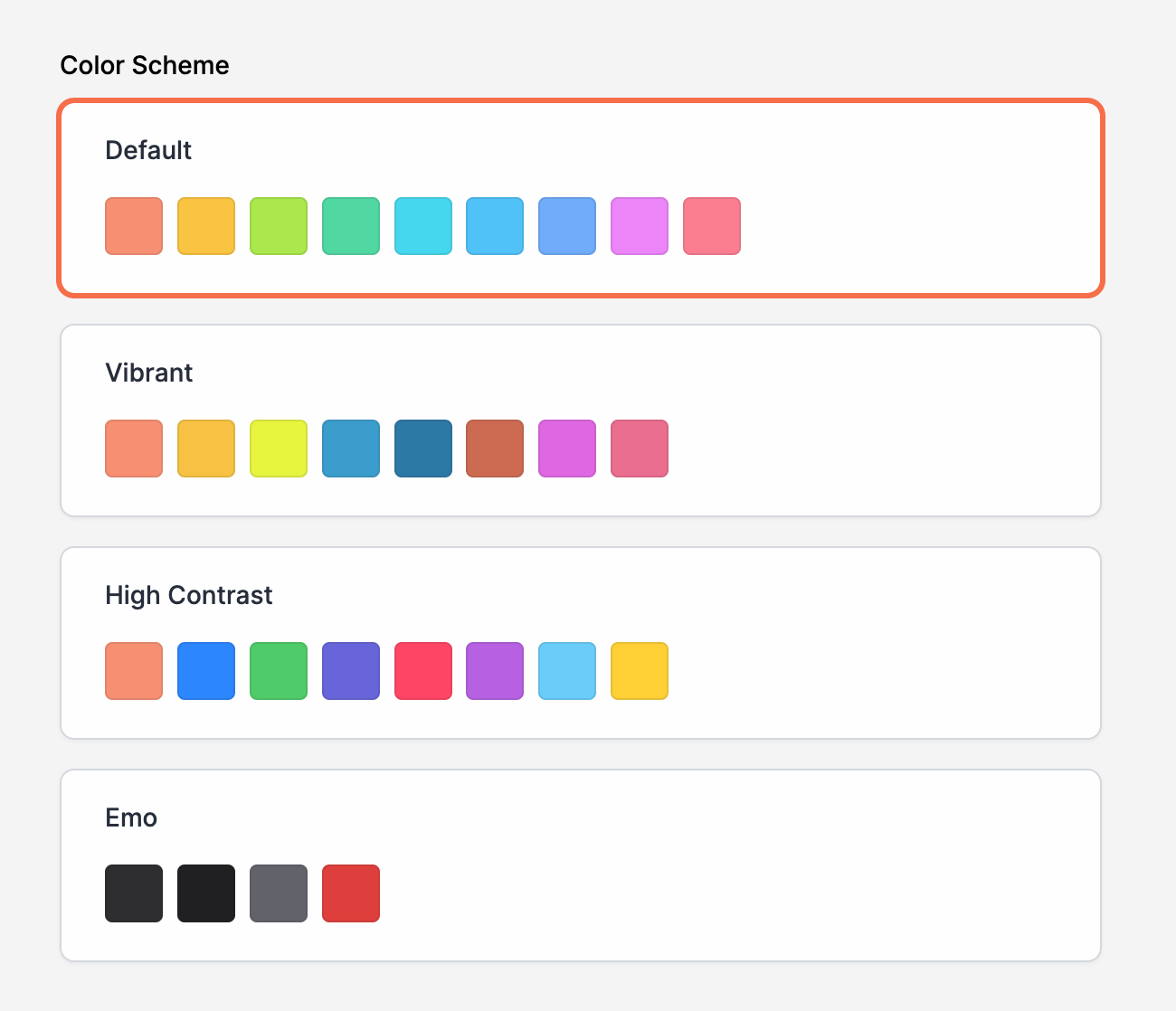
Our color schemes
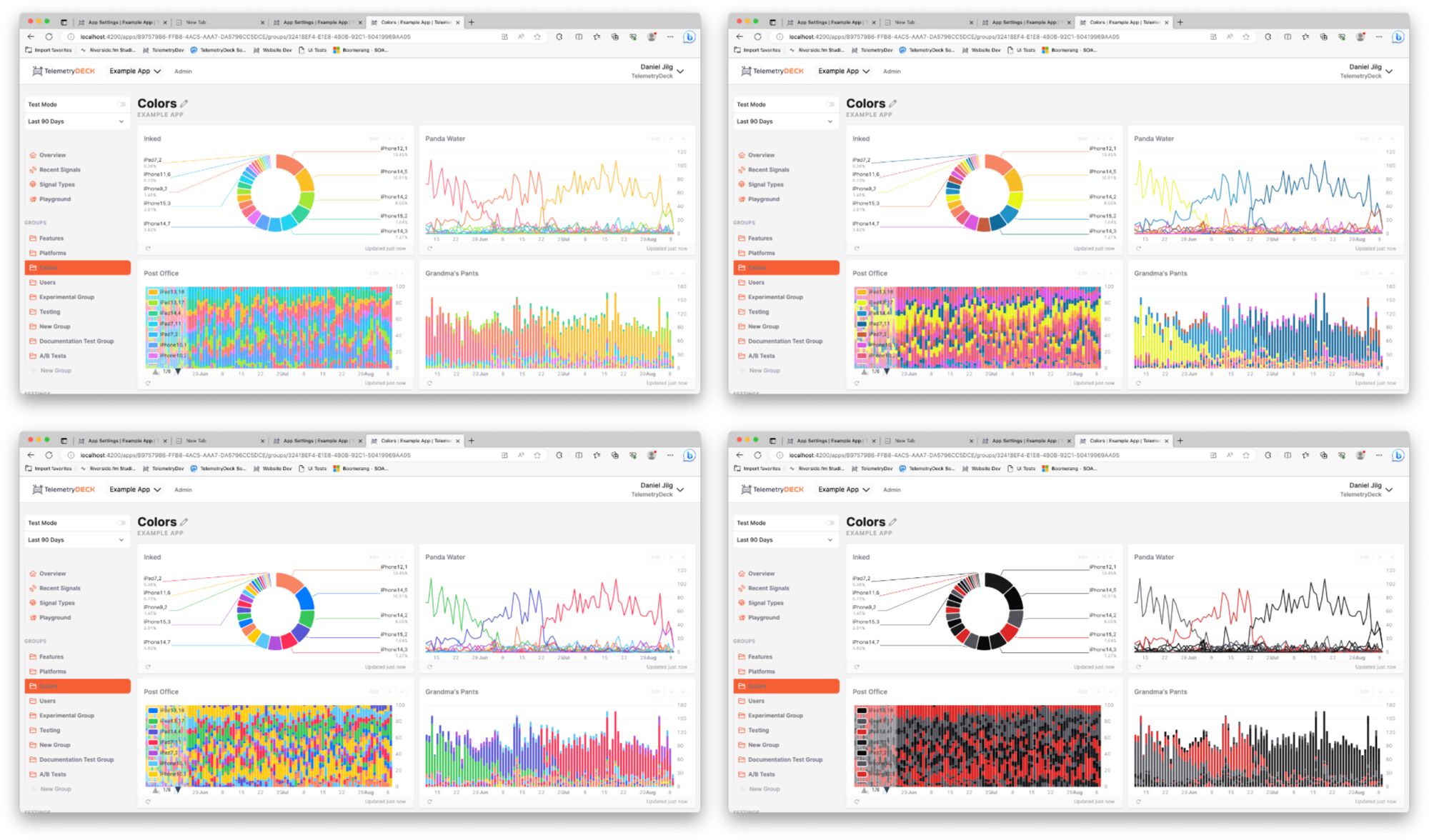
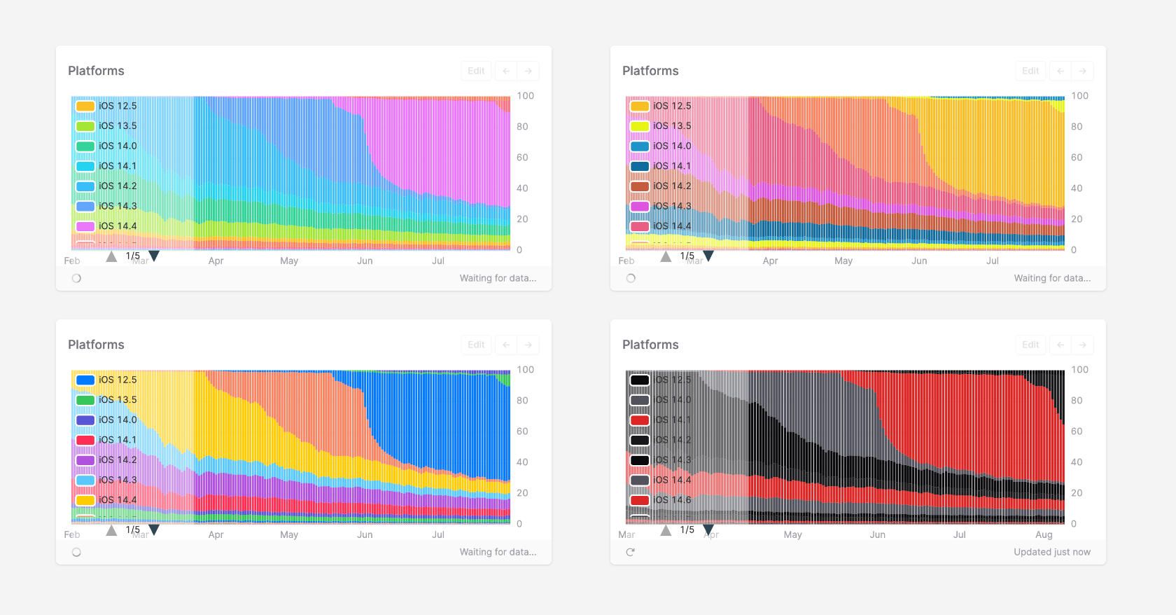
In this version, we're releasing four color schemes.
- Default, our wonderful rainbow-y color scheme you've all grown to know and love.
- Vibrant, a color scheme directly influenced by the reflective properties of Vibranium
- High Contrast, which shares a lot of DNA with the "safe colors" in Apple's Human Interface Guidelines
- And lastly and not entirely seriously, Emo, for when you want to blast Metal and hide in your room!
I hope you'll have lots of fun with the new color schemes. Let us know how they work for you, and what else you'd like to see in the future! 🌈