
View this page as Markdown • #docs #articles #beginner #how-to #quickstart #user-cohorts #insights
Track the number of daily users in your app
As creators of apps, the feeling of knowing that your app gets used is amazing. Here is our step-by-step guide for getting a handy insight into your daily active users' statistics!
Insights of daily active users are the best way to see how your app is doing. You will know if your app is on track, you can get helpful information during specific periods (holidays, product launches, etc.), and just the general feeling of knowing your app gets used is not to be underestimated (it certainly gives us a warm glowy feeling ☺️).
We will help you set up your insight so you can track your users right away, privacy-friendly and anonymized!
Navigate to your app
To create insights, you first need to create an app. If you have not created and linked your app yet, check out our guide Making an Account first.
In your browser, navigate to the dashboard. There you will find a drop-down menu on the top left side, next to the TelemetryDeck logo. Choose your app from here.
Select or create a new group
A great tool for all your insights is grouping! They help you group your insights the way you like them. We provide you with a row of display options so that your groups become a quick way to get information about your app’s data in a single click. Let’s navigate to an existing group or create a new one.
Creating a new insight
While in your group, you will see a Create new Insight field. Depending on if there are already existing insights, you may have to scroll down to find them. Click on + Create new Insight.
Use templates or create your own insight
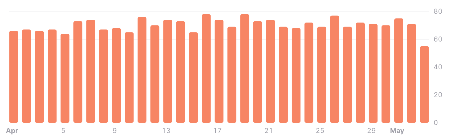
The fastest way to get insights about your daily users is by using our templates. Choose Daily Active Users and a new insight card will be created. The default display type is a line chart that will show you the daily active user count at a specific time. Learn how to configure your insight to your needs.
The most common display types for Daily Active Users are the line chart, the bar chart, or the table. Choose the one that fits your needs the best. You can always adjust the parameters of your insight at any time. You want to change from daily active users to monthly active users? Just change the granularity from displaying users per day to users per week, month, or even per year.
And you’re done!
Did you know that there is a lot more you can do with your insights? Check out the following article:
Next Up: How to Find Out Which Operating System Your Users Are Using →