
View this page as Markdown • #docs #articles #setup #beginner #insights
What are insights and how do they work?
An Insight is a configurable way of looking at your signal data. You can think of it as a pre-defined database query with filters and groupings. This query runs on the set of signals received in the currently visible date range and is displayed in a customizable way. This document gives you a reference to the various parts of the Insight configuration and what they mean.
What is an insight?
Insights are a fundamental part of analytics. They describe how analytics data is translated in a readable way so developers can act accordingly. Insights help us understand data, both individually and as a conglomerate. They show us how our apps perform, how users adapt to new changes, tell us how willing they are to update, and a lot more!
The best way to read Insight data is by putting them into fancy Insight cards! An Insight card is one of the primary building blocks of TelemetryDeck. Essentially, they are one of the little cards in our dashboard, with data in an Insight group. They have a title, a query, and a display mode.
The query is used to retrieve data from the TelemetryDeck API, and the display mode is used to determine how the data gets displayed, for example, as a bar chart or a line chart.
Check out our YouTube Channel to learn how our built-in charts work!

Versatile and adjustable
Insights are incredibly versatile: They can count either signal or users. If needed, they can be restricted to specific signal types, such as “the app launched” or “the user did x”. Insights can be filtered by their metadata, too! For example, to only show signals from iOS or a specific app version.
They can show a breakdown of all available values for a given metadata key; this makes it easy to show what percentage of an app’s users have a feature enabled or on which platform the app gets used the most. Time-wise, insights can group their signals by the hour, day, week, or month, allowing for a fine-grained view or a good overview.
Finally, all insights can display their data as a table, bar chart, line chart, or donut chart. All these configurations can be changed and experimented with on the fly, allowing developers who use TelemetryDeck to dive into their data quickly and easily. In the following sections, we explain insight data and insight cards in more depth.
Insight data - How it works
Each insight runs its filters, groupings, and breakdowns (see below for more on those) on all Signals received for the currently selected app in the currently selected date range.
Signals have a type, which is the name of the signal, such as AppLaunchedViaNotification or SettingsShown; a user, which is a string representation of a hashed user identifier; plus a payload, which consists of various metadata, such as operatingSystem, platform, or custom metadata you want to deliver with each signal.
Calculating insight’s data will yield several, for lack of a better word, rows of data, with each line having a title (either a string or a date) and a result (either a string or a number).
Here are some examples of what a line of data could be:
- a time series with each line representing a date, and the number of active users on that date
- a breakdown of the usage of a feature, with one line “enabled” and the number of users who have that feature enabled, and one line called “disabled”
- a single line for the active users in the current month
How to configure your insight card
Title
The title is displayed on top of any insight card. Example: “Daily Active Users”
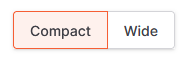
Compact and wide mode
You can choose between “Compact” and “Wide”. If “Wide” is active, the insight will be displayed in a larger frame. This allows you to see your most important insight with extra detail.
Display Mode
Here, you can choose the most suitable chart type for your insight. Learn more about the chart types in the section Chart Types.
Counting
If “Count Signals” is checked, an insight will count all signals by their type. If “Count Users” is checked, each user will only get counted once. Only the newest is selected if the set of signals counted by the insight contains multiple signals from the same user. This is great for counting users, for example, “How many users are using feature x?”
Granularity
This lets you group signals by time interval - the more fine-grained the grouping, the more separate values you’ll receive.
This will put your signals in datetime-based buckets, depending on the time they were received. The more fine-grained settings, like hour and day, are great for looking at individual days or weeks. Settings like week and month are great for month-over-month or year-over-year comparisons and are especially important if your users don’t use your app daily.
Filter
Insights that don’t have a signal type specified will take all signals for the current app that were received in the currently selected date range. If you do specify a signal type, only signals of that type will be included in the insight’s calculation. You can add conditions to further filter your signals.
Query Type
Time Series
A time series insight looks at discrete chunks of time and counts values in those times, for example, ‘Signal counts for each day’. These are best used with line charts or bar charts.
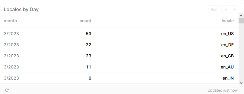
TopN
Whenever you choose TopN as a query type, you can configure it under TopN Configuration, which will pop up below. Suppose you enter a breakdown key for an insight. In that case, the calculation will switch from time series mode to breakdown mode, resulting in a breakdown of possible values for the specified metadata payload key. For example, all signals contain, by default, the system version of the sending app in their metadata. If you enter systemVersion as the breakdown key, you’ll receive rows specifying how many signals were received for each possible system version.
Filters
Filters consist of a key and a value. If any filters are entered for an insight, the insight will only count signals with that key-value pair in their metadata payload. All filters must apply for a signal to be counted if multiple filters are specified.
If, for example, you use the same code base for the iOS and macOS versions of your app, but you want a breakdown of only iOS signals, add a filter of platform: iOS to your insight.
Generated Query
You can optionally convert your insight into a “custom query insight”. This allows you to edit the database query in the insight directly, giving you more control.
A custom query is a JSON object in the TelemetryDeck Query Language (TQL), a superset of the Druid Query Language. See the Druid Query Documentation for a jump start. In addition to the Druid features, custom queries in the TelemetryDeck Query Language can contain a relative time interval.
During execution, we will automatically wrap your query in a filter that makes it apply to all your organization’s apps. To query a single app, filter for that app’s app ID.
Check out our YouTube Channel on how to create custom charts!
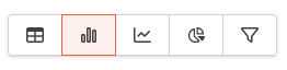
Chart Types
No matter the data you want to get insight into, there is always a chart type that fits best. Deciding which of these different chart types works well with the kind of data you want to process can be tricky. We will explain how the different display types work, making it easy for you to decide which fits your needs!
Table
It will display the query result as a raw list of numbers. If the query results in a time series, this will give you a list of dates and the numbers associated with those dates. If the query is a breakdown, this will provide you with a key-value list, such as the number of users per device type.
If only one line of data is returned, that line will be displayed in large type. If exactly two rows of data are returned, the first one will be displayed in large type and the second one smaller below that, with the percentage difference between the two numbers. This allows you to have a “Active Users this Month” type of display, with a comparison to the previous month.
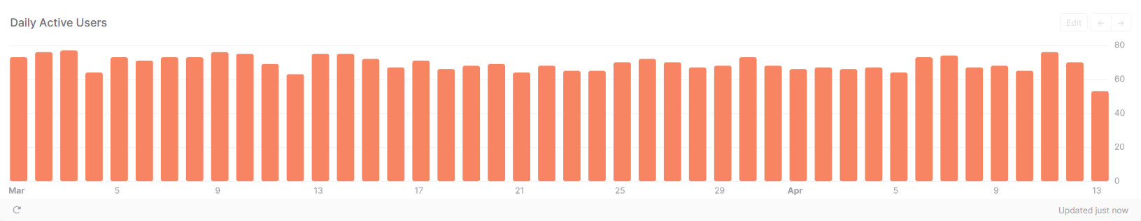
Bar Chart
It displays the query result as a vertical bar chart, one bar per line of data. This works for both time series data and other types, such as breakdowns.
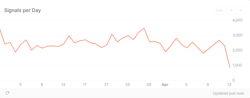
Line Chart
This chart shows the query result as a line chart, one bar per line of data. This works best for time-series data. Displaying other data doesn’t make a lot of sense in this chart type.
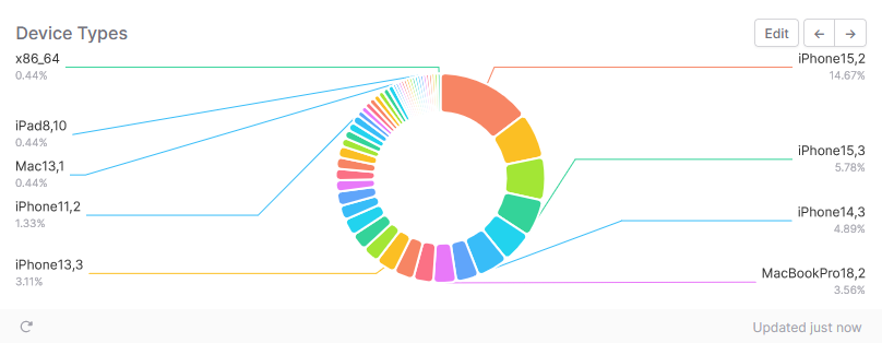
Donut Chart
A pie/donut type chart that will sort the rows of data by number and visually show their percentage of the whole.
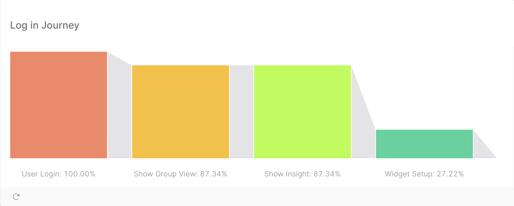
Funnel Chart
In combination with the filter editor, this chart displays when a user ends a process within your app - breaking it down into visual steps that show exactly how many users stayed in a process.