
Colorful Charts
We get a lot of feature request, and oftentimes they don't have much overlap: One person really needs feature A to do their work, another person would very much have feature B.


But one feature that really everyone seemingly wants is chart colors. It started a few weeks ago, when Apollo Creator Christian Selig suggested the feature.
At the same time, people in our Slack started to think about ways of organizing and categorizing Insights, besides Insight Groups, and also settled on colors as something they would really like to see.
This way app developers can set up an even nicer-looking dashboard that gives them an overview of their users, the OSes out there, the devices used, and all the other knowledge they gain from using TelemetryDeck.
So I set to work! I decided I'd store a hex code with the Insight, but I wanted to avoid having a color picker in the app. Instead, the idea was to have a pre-defined set of available colors that are legible and go well together. This way, our users have lots of freedom, but don't get bogged down in picking the perfect color.
We settled on 9 colors, plus the default Telemetry Orange. Their names are pure randomness, with some random associations my brain made up on the spot thrown in for good measure. Updating the API was not a problem, since the parameter is purely optional and current and older version of TelemetryDeck Viewer just ignore the value.
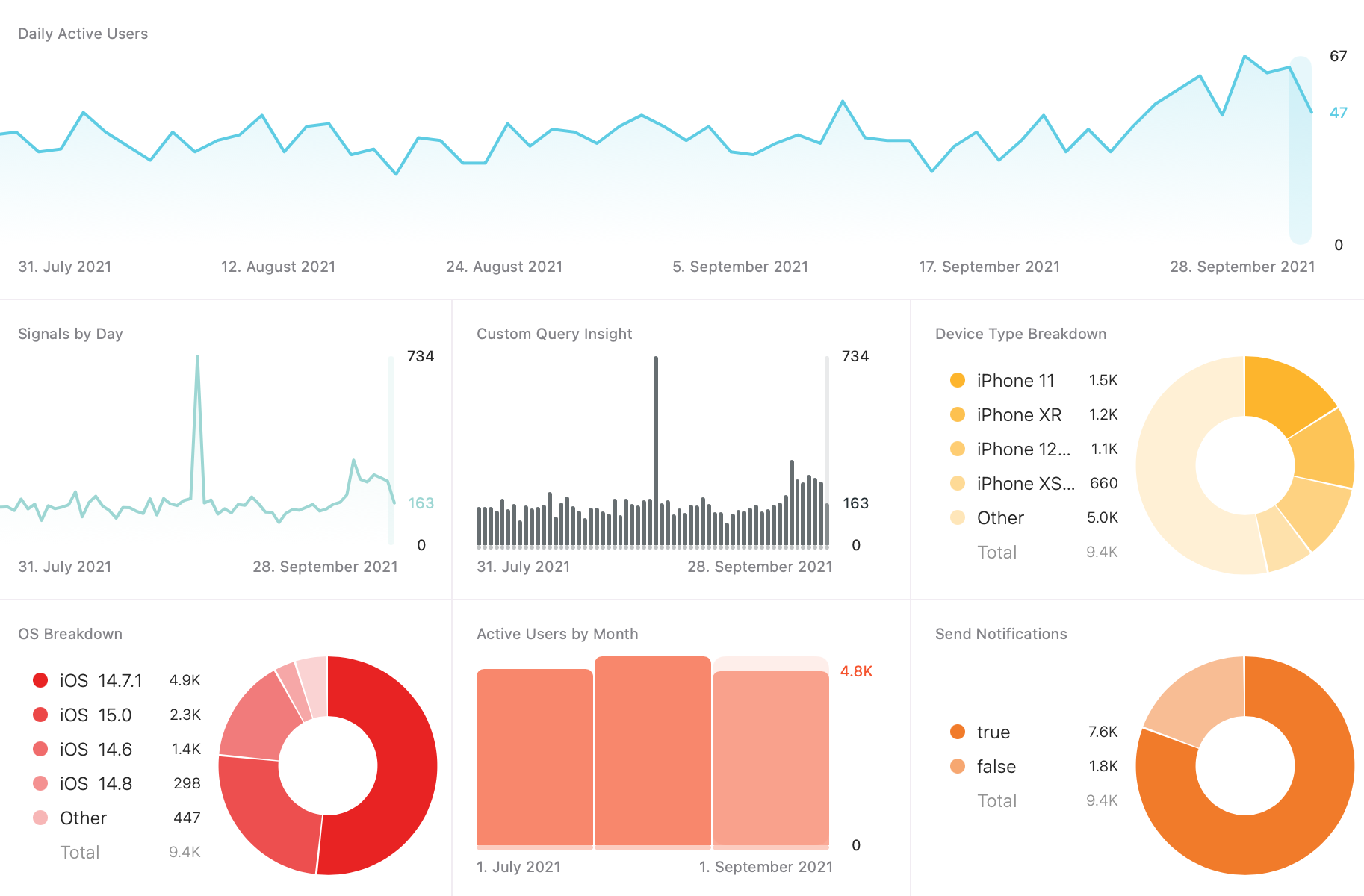
We have just released a new version of TelemetryDeck Viewer Beta which includes the Color Picker feature! If you don't already use TelemetryDeck, now is a great time to get it for free. Include the Swift Package within your app in a matter of minutes, and see real, useful, and anonymized data in real time without compromising your users' privacy.
Have a wonderful Day 🤙
– Daniel