
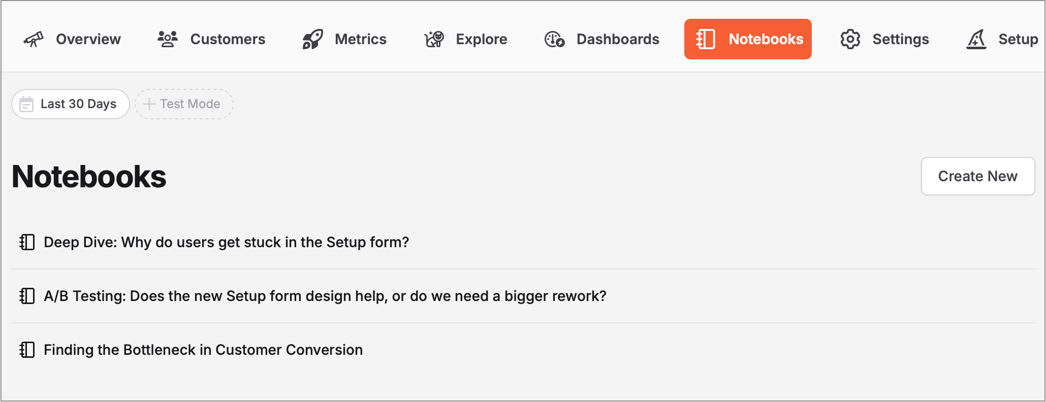
Maintain analytical context with Notebooks
Notebooks combine live charts with your analytical thinking, helping you preserve context and momentum in your investigations. When you need to wait for new data, notebooks ensure you can pick up right where you left off, turning fragmented analysis into complete insights.

In this blog article, we explain the new “Notebooks” feature that TelemetryDeck App Analytics now supports. This tool allows you to create your own pages where charts and text fields can be arranged as you wish. This makes it easier to document your own thoughts and observations on the data and trends you have recorded.
The analysis paralysis problem
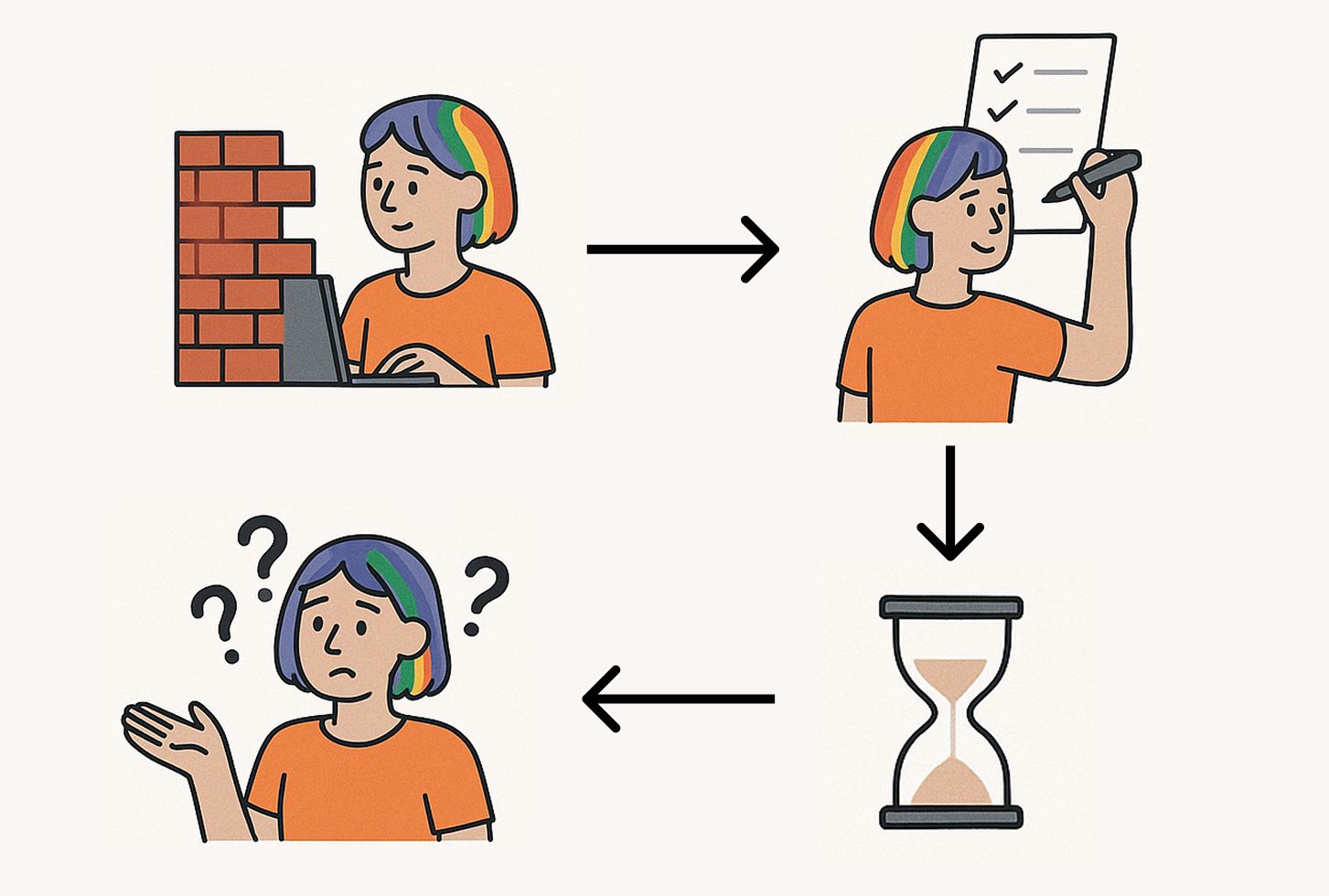
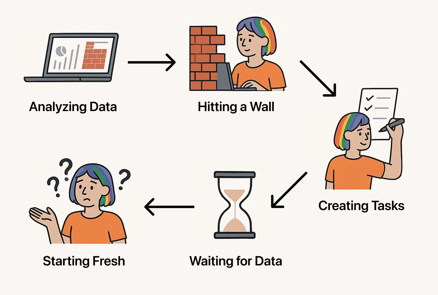
You have a question about your app. Maybe user conversion is lower than expected, or a feature isn’t being adopted as quickly as you’d hoped. You dive into your analytics, create a few charts, and start finding answers. But then you hit a wall—you need more data to complete your analysis.
You create tasks to add the missing events or parameters to your app, but it takes weeks until the new data finally arrives, and you lose the context of your investigation. You vaguely remember your initial findings but can’t recall exactly what you were looking for or why. Not only that, but you end up starting from scratch, wasting time and potentially missing important insights.
This is a form of analysis paralysis—the cycle where analytical work never translates into actionable decisions because the process lacks structure and continuity, especially when waiting for new data to arrive.
How the Notebooks feature supports you
TelemetryDeck Notebooks break this cycle by combining your analytical thinking with live, updating charts in a single document. Think of them as your analytics lab notebook—a place where you can:
- Document your questions alongside the data that answers them
- Create charts while you're motivated during active investigation
- Return quickly to context since everything is preserved together
- Identify exactly what’s missing to make informed decisions
- Turn insights into clear next steps instead of abandoned analysis
Creating charts in Notebooks
Adding charts to your notebooks is easy:
- Create your chart in the Dashboards tab using TelemetryDeck’s web editor
- Once you’re happy with the chart, click the “Actions” menu
- Select “Copy TQL” to get the query of the chart (this is a new feature!)
- In your Notebook, create a code block with three backticks (```) followed by
tqland paste the query:
Notebook Excerpt

Let's see what users do in the welcome screen:
```tql
{
  // Your chart's TQL query will be here
}
```
The chart will automatically update with new data as it arrives, keeping your analysis up-to-date whenever you return and look at it.
💡 Tip: Notebooks support all standard markdown features. You can add links, images, code blocks, and more. For images, we recommend to upload them somewhere (like Imgur, imgbb, or your own server) and use standard markdown image syntax: . This is great for adding screenshots, diagrams, or any visual aids to your analysis.Advantages of working with the Notebooks feature
Notebooks align perfectly with TelemetryDeck’s privacy-first approach through data minimization—a core principle of privacy-focused analytics. Instead of tracking everything possible and hoping to find insights later, notebooks encourage you to:
- Start with specific questions about users or app performance
- Identify exactly what data you need to answer those questions
- Implement only the tracking required for your investigation
This approach respects user privacy and saves significant development time since there's less logic to track in your app. You avoid building analytics infrastructure you don’t actually need while ensuring the data you do collect serves a clear purpose.
Example: Onboarding analysis
As both a TelemetryDeck team member and an indie developer, I’ve been using notebooks to analyze the onboarding flow of my app TranslateKit, which helps developers localize their iOS/Mac applications. Here’s how it helped me maintain context in my investigation:
The question
I wanted to understand how well the app converts installations into paying customers. My initial hypothesis was that the welcome window might be causing issues—after all, it resembles Xcode’s welcome screen, but unlike Xcode, TranslateKit operates in a competitive market.
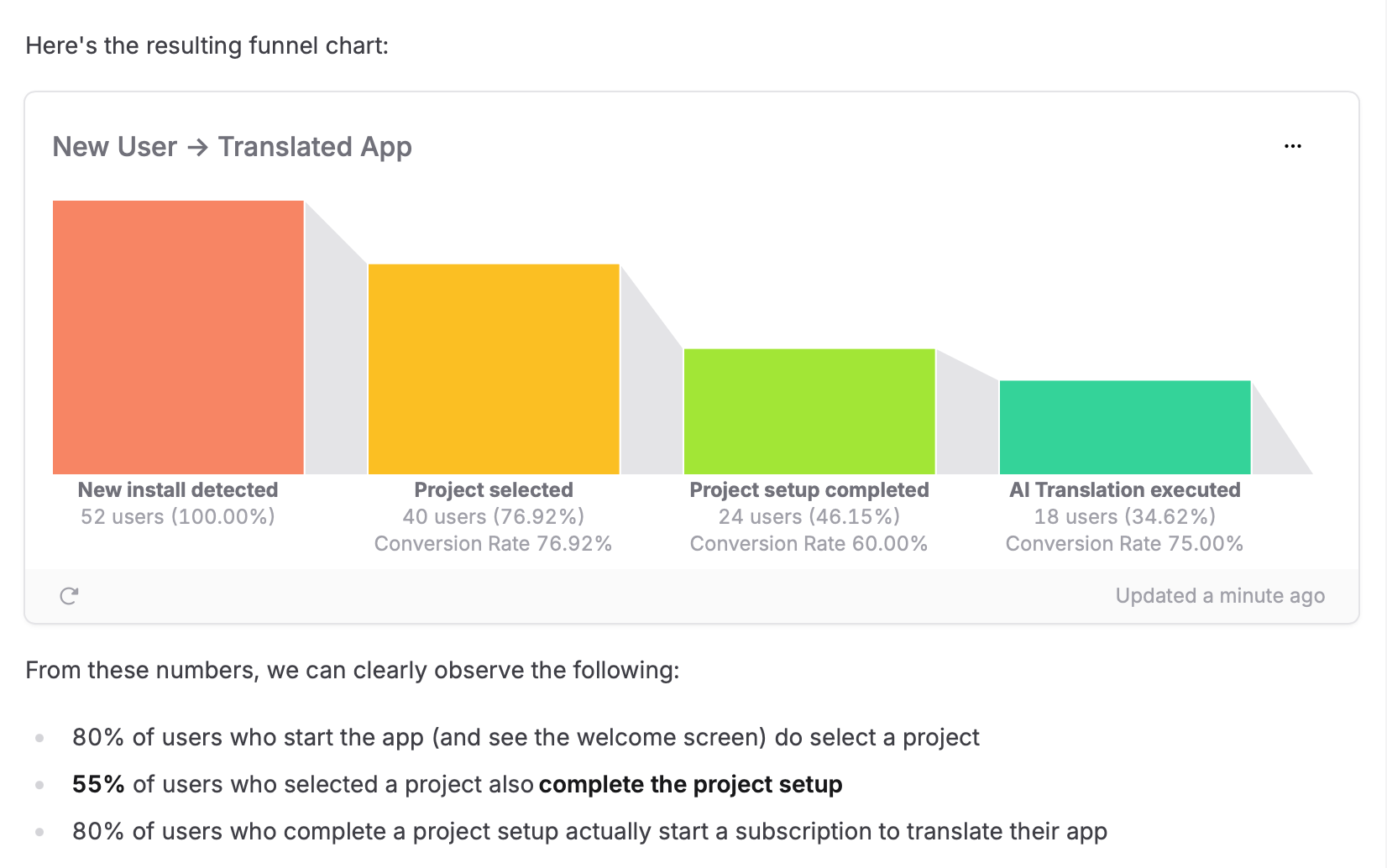
Setting up the funnel analysis
I created a funnel chart tracking the complete user journey from installation to first successful value delivery:
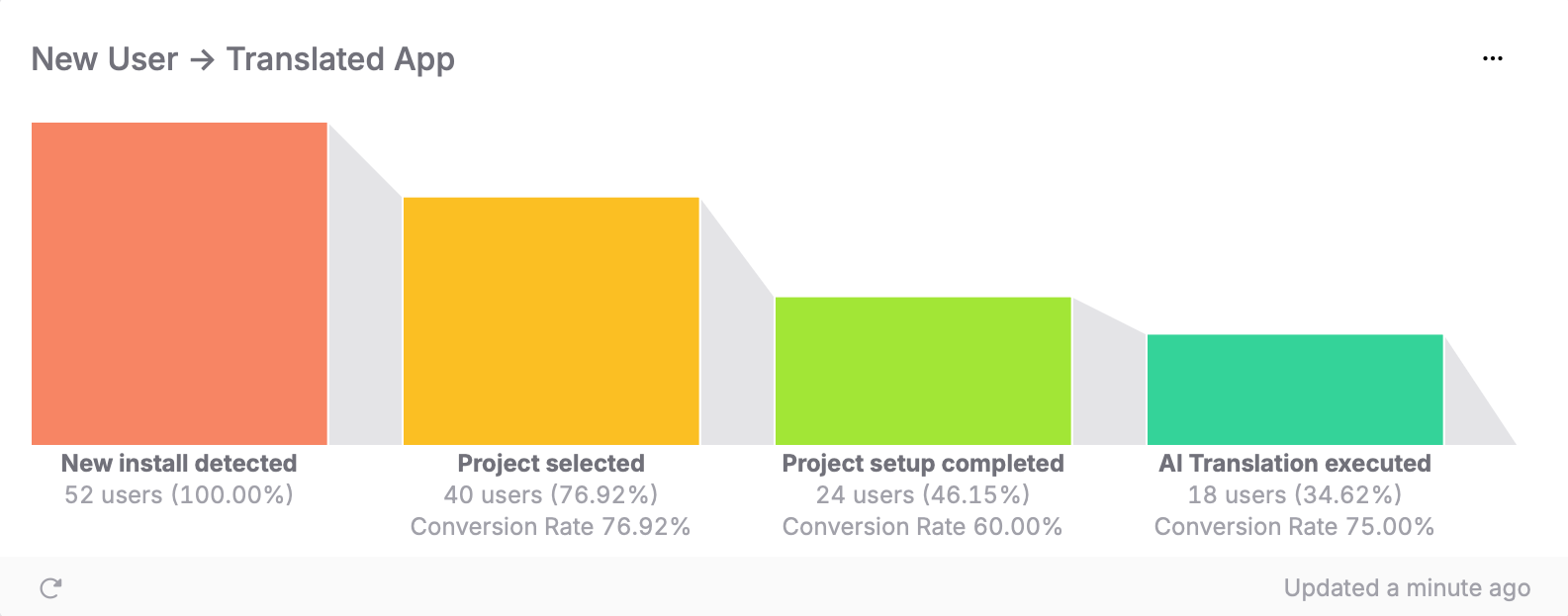
The surprising results
The data revealed something entirely different from what I expected:
- ~80% of users in the welcome screen proceed to the next step.
- ~60% of users who reach the setup step complete it. ⚠️
- ~80% of users who complete setup convert to paying customers.
Initial insight: Welcome ≠ Problem
My initial theory was wrong. The welcome window actually performs well with an 80% conversion rate. The real bottleneck is in the setup step, where I lose 40% of users—double the drop-off of any other step.
Next step: Deeper investigation
To understand why users are dropping off, I needed more granular data. This is where notebooks really shine—they let you document not just your findings, but also your hypotheses and the data you need to validate them.
I created a new section in my notebook to track this investigation:
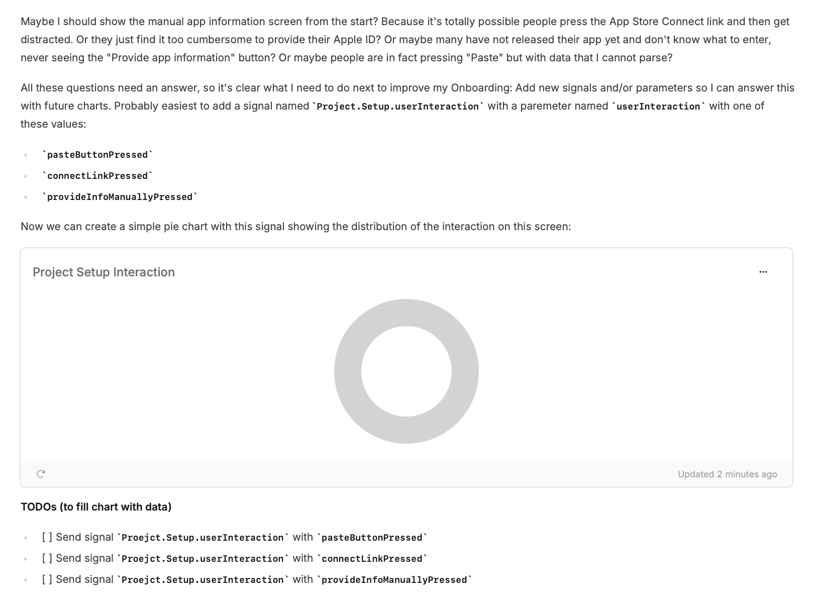
In this section, I documented:
- My current hypothesis about where users might be getting stuck
- The specific data points I need to validate this hypothesis
- Implementation tasks for the development team
- Charts that will show data once the new tracking is implemented
This approach has several benefits:
- Context preservation: When the new data arrives weeks later, I can quickly understand what I was looking for and why
- Clear implementation requirements: I have a clear list of what has to be tracked
- Hypothesis testing: The placeholder charts are already set up to validate or disprove my theories
- Knowledge sharing: Other team members can understand the investigation’s progress and contribute their own insights
The notebook becomes a living document that grows with the investigation and serves as your bookmark into more profound analysis!
Documenting learnings
As the investigation progressed, I realized I should document my key learnings in the notebook. I even wrote down my stats findings in Markdown right below the charts, which might seem like duplicate work but turned out to be super useful because the charts are auto-updating and might have different results at a later time. This way, I have a clear record of how my understanding evolved. And it's also great to see if an issue was resolved since the old values are documented and can be directly compared against the current in the chart!
The notebook preserved my context and analysis while I waited until I had implemented the tracking tasks. When the data started flowing, I could quickly pick up where I left off and continue my investigation.
A true game-changer I hadn't expected from a seemingly simple feature!
See it in action in our feature demo video on YouTube:
Get started today
Here's a step-by-step guide to help you get started:
- Pick your first question
Choose a specific question about user behavior or app performance. - Create your first notebook
Start with a clear title and your specific question. - Build initial charts
Create charts using existing data to establish a baseline understanding. - Identify what’s missing
Note what additional tracking would help and create charts up-front. - Set a follow-up date
Schedule time to revisit your notebook once new data is available.
I can only recommend getting your hands dirty and starting to investigate your users data with notebooks. You will appreciate the additional context!