
Ahoy! Chart your app's growth with our new Acquisition Dashboard 🏴☠️
We're raising the Jolly Roger on our new Acquisition Dashboard – the first complete implementation of the Pirate Metrics (AARRR) framework in TelemetryDeck. With zero additional code, you'll gain unprecedented visibility into how NEW users discover your app, when they find you, and what devices they're using – all critical information for optimizing your marketing and growth strategies.

We've been navigating the treacherous seas of analytics to bring you treasure without making you walk the plank! Today, we're hoisting the flag on our new comprehensive Acquisition Dashboard – the first completed quadrant on our Pirate Metrics treasure map that gives you X-marks-the-spot visibility into how NEW users discover your app, without writing a single line of extra code!
The first "A" in "AARRR" just got awesome
Understanding how NEW users find your app shouldn't require a spyglass and a degree in data science. We've taken the research-backed Pirate Metrics framework (AARRR – which is both what pirates say and a brilliant acronym for Acquisition, Activation, Retention, Referral, Revenue) and transformed its acquisition principles into intuitive charts that focus specifically on NEW users – helping you track exactly how, when, and where people are discovering your app for the first time.
Your treasure chest of NEW user insights
Just updated your SDK? Congratulations, you've already been collecting this data! Open your dashboard and discover:
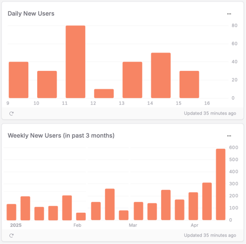
New user growth trends
Track daily, weekly, and monthly new users with charts that reveal the size of your growing armada. Did your Twitter thread go viral? You'll see that spike. Running a new App Store campaign? Watch your fleet grow in real-time. Unlike your existing analytics, these charts focus exclusively on first-time users.
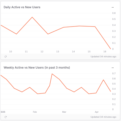
Active vs. New Users Ratio
Are you recruiting new deckhands or mostly sailing with your veteran crew? This metric reveals if you're expanding your user base or primarily serving the loyal sailors who've already signed up for the voyage. 🦜
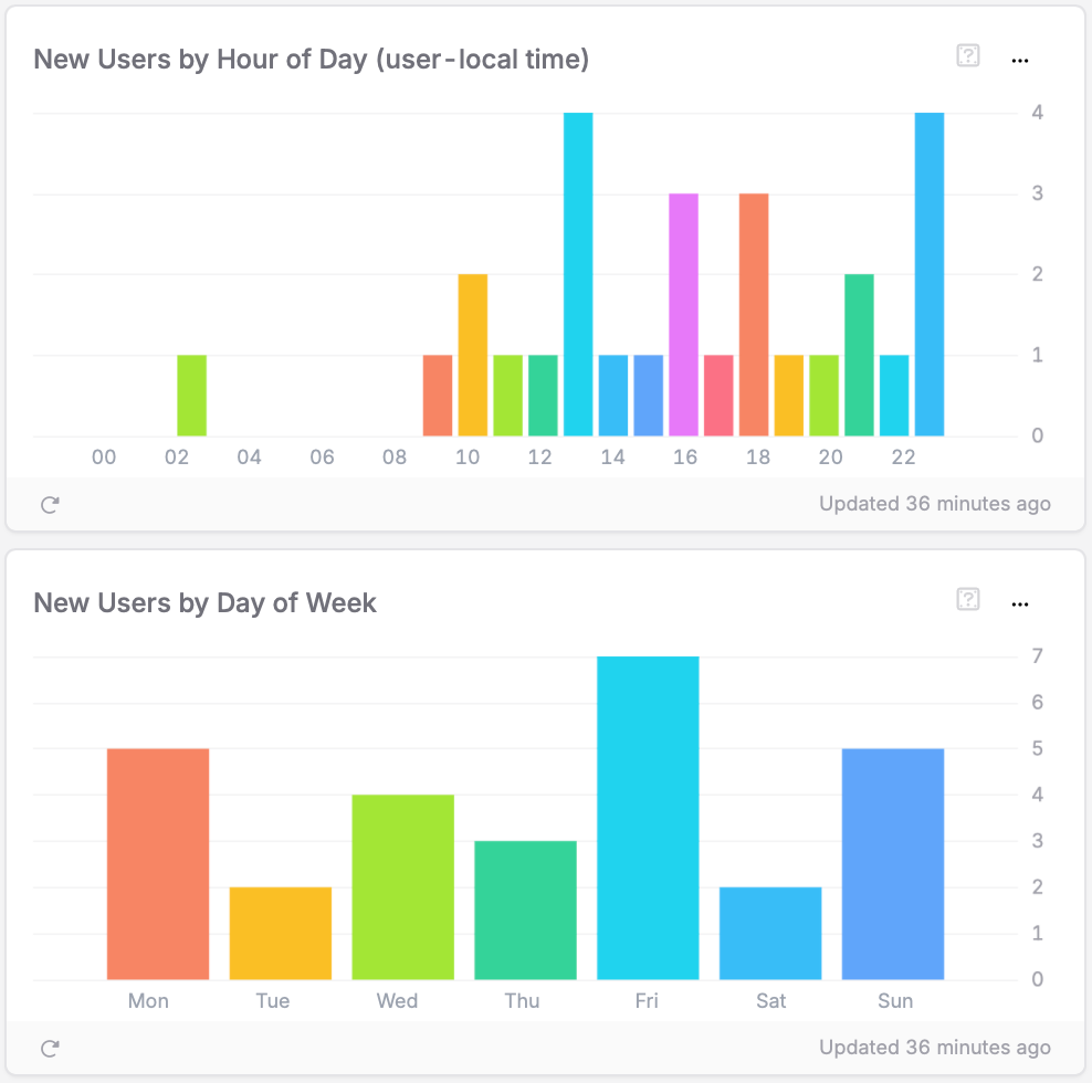
Temporal usage patterns: When do NEW users set sail?
Turns out, users don't randomly discover apps like bottles washing ashore. They follow patterns! Our temporal charts show exactly when during the day and which days of the week NEW users typically find and install your app for the first time. Spoiler alert: Apparently, nobody discovers apps during their 3am insomnia scrolling sessions (or do they?).
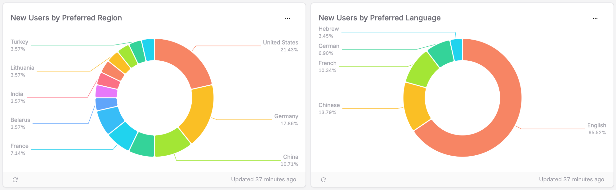
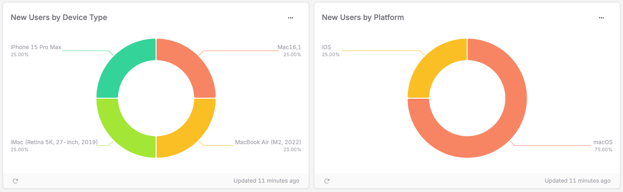
Device & Geographic distribution: Who's who in your NEW crew
Is your app attracting iPhone 15 Pro Max captains or iPad Air deckhands? Are they sailing from the shores of San Francisco or the harbors of Hamburg? This data helps you know exactly who's downloading your app for the first time and from where – critical information that differs from your overall user base.
Making your data actionable
These aren't just pretty charts to show at your next stand-up. Here's how to turn these NEW user insights into real treasure:
Time Your Marketing Cannons: Your acquisition charts will reveal when YOUR specific NEW users tend to discover your app. Are they morning birds who find you before work? Lunchtime browsers? Evening app store scrollers? Whatever patterns emerge for your unique audience, use them to time your marketing volleys accordingly!
Know Your Fleet: If you discover that 30% of your new users are rocking the latest iPhone while only 1% are on older models, you can finally win that argument about dropping support for iOS 15 (you're welcome). If your main goal is to grow your user base, you should focus on new customers, which can have a quite different distribution than your existing ones!
Discover New Territories: Finding unexpected growth in Germany despite your app being as American as apple pie? Might be time to say "Guten Tag" to localization and ride that wave of unexpected popularity.
The magic words (that make it all work)
Just update to our latest SDK versions and unlock this treasure trove:
- Swift SDK: 2.8.0+ (for the Apple aficionados)
- Kotlin SDK: 6.0.0+ (for the Android adventurers)
- Flutter SDK: 2.3.0+ (for the cross-platform corsairs)
Then navigate to Customers > Acquisition in your dashboard and behold your bounty of beautiful visualizations – all focused on NEW users.
This ship has just left port
The acquisition dashboard is just the beginning of our journey through the Pirate Metrics seas. We're already charting courses for Activation, Retention, Referral, and Revenue dashboards – each designed to give you actionable insights without requiring you to become a data science expert.
Ready to explore your new user acquisition data? Head to your Acquisition Dashboard now, or check out our detailed guide to acquisition analytics and our introduction to the Pirate Metrics framework to learn the ropes.
Now hoist your colors and set sail for new horizons – there be a bounty of users waiting to discover your app-sized treasure! 🏴☠️