
Introducing Notebooks
We just launched a new feature that helps you explore your analytics data in a more structured, human way. It’s called Notebooks, and it lets you combine charts and text to structure your thoughts for yourself or the people you work with. Use it in your next deep dive, team briefing, or onboarding session.

Charts are useful. Text is useful. But together? They’re how people actually work through problems. Notebooks let you assemble markdown and live TelemetryDeck charts in one place, so you can capture what you’re seeing and what it means.
Whether you're chasing down a performance issue, preparing a presentation, or leaving notes for your future self, Notebooks give you a single, coherent view of what matters.
We love Markdown
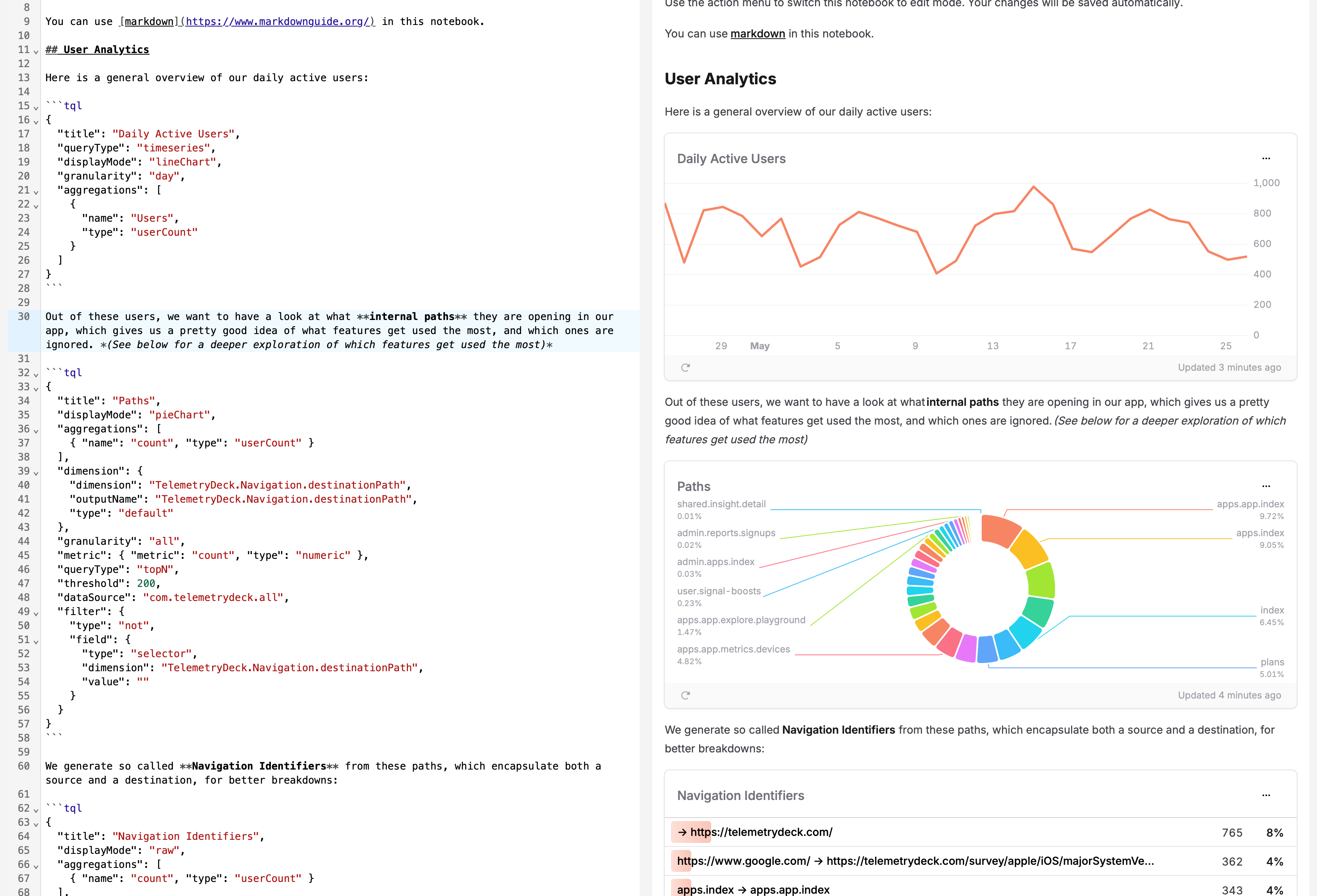
You can edit your notebooks using Markdown, the the simple and easy-to-use markup language you can use to format virtually any document. Create headings with # or ##, use asterisks for bold and italic, and begin code blocks with three backticks! ```
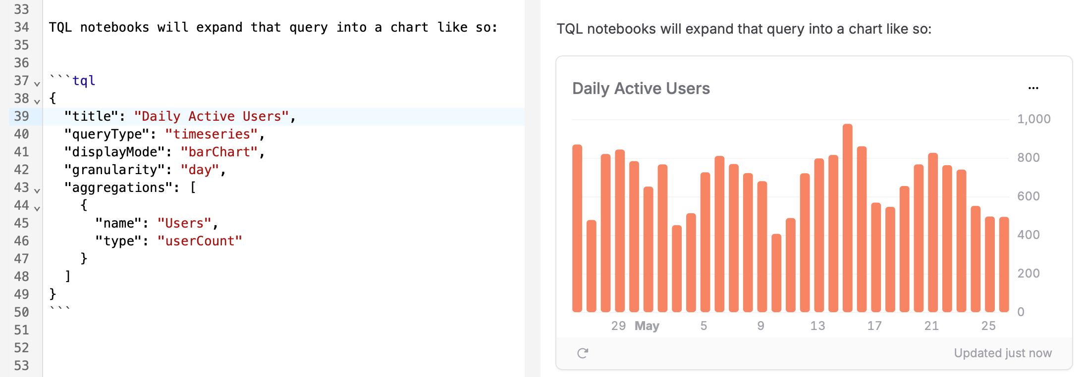
Speaking of code blocks, if you begin one with ```tql, we''l render the result of your query as a chart, directly inline in your Notebook, which is a fantastic way to structure your thoughts.
Notebook


```tql
{
  "title": "Daily Active Users",
  "queryType": "timeseries",
  "displayMode": "barChart",
  "granularity": "day",
  "aggregations": [
    {
      "name": "Users",
      "type": "userCount"
    }
  ]
}
```
Live, Not Static
Each chart in a Notebook is tied to a TQL query. That means every time you open the Notebook, you’re seeing fresh data. No need to manually reload or re-run anything.
Notebooks also update live as you edit them, with the preview window directly next to the code. This is super helpful to play around with how your findings are presented, or to find out which way a query should be structured best.
Presentation-Ready
You can pick how your data is displayed using the displayMode setting. Go for lineChart when you want trends, barChart for categories, or pieChart if you’re feeling optimistic about pie charts. (We don’t judge.)
Use the title property to set a custom title for your chart.
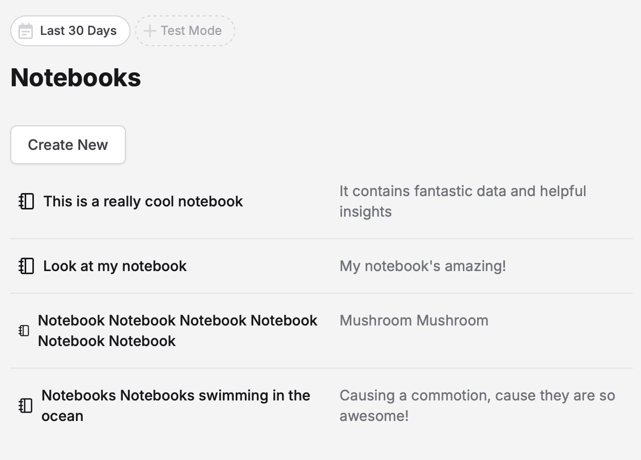
One Notebook or Twenty
There’s no limit to how many Notebooks you can create. Give each one a title and a subtitle, structure your findings, and keep your context intact. It’s a bit like having your own internal blog, but without the pressure of being interesting on the internet.
Use Cases We’ve Already Seen
- Tracking down a sudden spike in backend load
- Creating a weekly product health and KPI overview for stakeholders
- Onboarding a new team member without the usual flurry of Slack messages
- Comparing user behavior across product versions
- Exploring use of a specific feature in multiple aspects
Notebooks are now available to all TelemetryDeck users. There’s no setup required, just open the Notebooks tab and start typing.
If your data could use a little storytelling, now’s the time. 📙