#docs #basics #setup #basics #pirate-metrics #acquisition
Acquisition Analytics
Acquisition is the first stage of the Pirate Metrics framework, focusing on how users find and install your app. TelemetryDeck automatically tracks these patterns to help you make data-driven decisions about marketing, platform support, and regional strategy.
What is User Acquisition?
User acquisition represents the entry point of your app’s growth funnel – how users discover and install your app. These metrics help you understand your marketing effectiveness, identify your target audience, and spot growth opportunities.
With TelemetryDeck’s Acquisition dashboard, these insights are automatically collected and visualized with no additional code required beyond updating to the latest SDK version.
User growth trends
Questions you can answer:
- Is my user base growing over time?
- Are there patterns in my acquisition rate?
- How effective are my marketing campaigns?
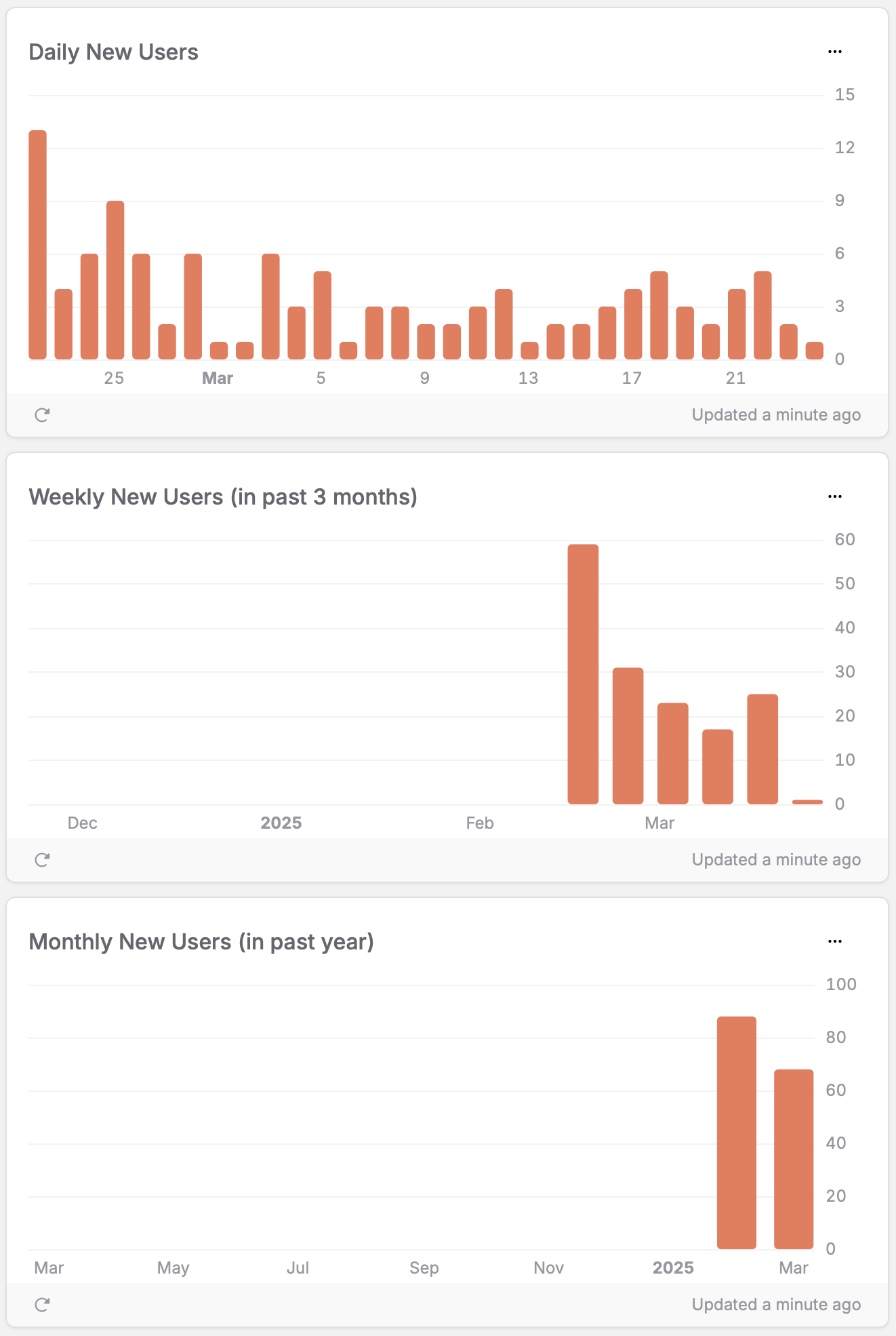
How to interpret the charts:
- Consistent upward trend: Your app is steadily gaining users – investigate what’s working and double down
- Sudden spikes: Often correlate with marketing campaigns, app updates, or press coverage – for example, the spike in February on the Weekly New Users chart might indicate a successful promotion
- Cyclical patterns: May indicate seasonal interest or day-of-week effects - like potential weekend vs. weekday differences
- Declining trend: May indicate market saturation or competitive pressures - requiring refreshed marketing
Action example: If you see that your user acquisition consistently spikes after releasing new features (as might be visible in the Weekly New Users chart), you could plan your marketing and development cycles to maximize this pattern.
New vs. active users ratio
Questions you can answer:
- What proportion of my users are new versus returning?
- Is my app primarily attracting new users or maintaining existing ones?
- How does acquisition compare to retention?
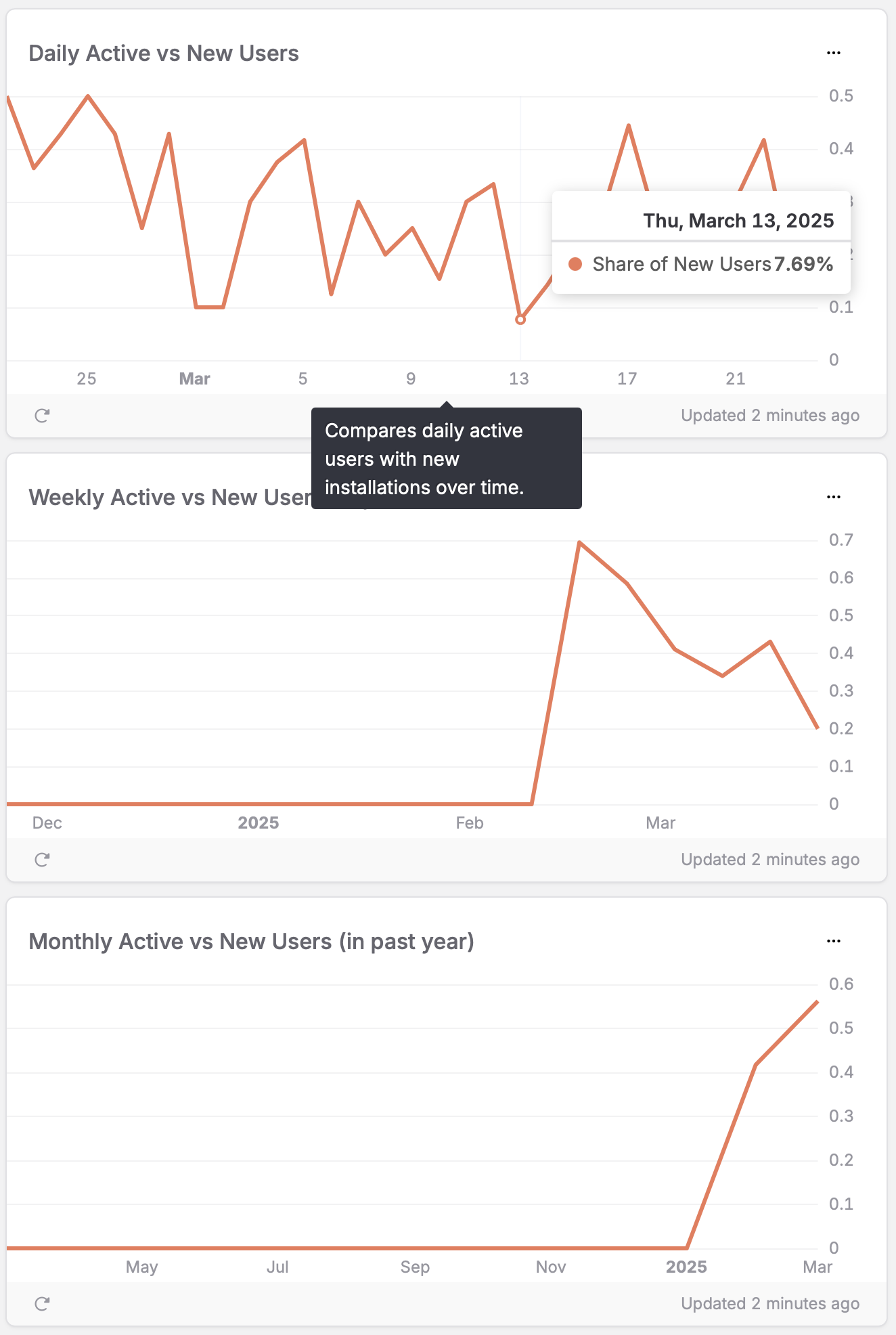
How to interpret the chart:
- High ratio (>0.5): Many new users compared to your active base - suggesting strong acquisition but possibly weak retention
- Low ratio (<0.2): Most of your active users are returning users - indicating strong retention but slower growth
- Fluctuating ratio: May indicate inconsistent marketing or seasonal patterns
Action example: In the Daily Active vs New Users chart, you can see the ratio fluctuating between approximately 0.1 and 0.5. When it drops to 0.1 (as seen around March 13th), it suggests that only about 7.69% of your active users that day were new installations - the rest were returning users, which indicates good retention but might signal a need to boost acquisition efforts.
Temporal usage patterns
Questions you can answer:
- When during the day do users typically discover my app?
- Which days of the week see the most new installations?
- Do weekdays significantly outperform weekends for user acquisition?
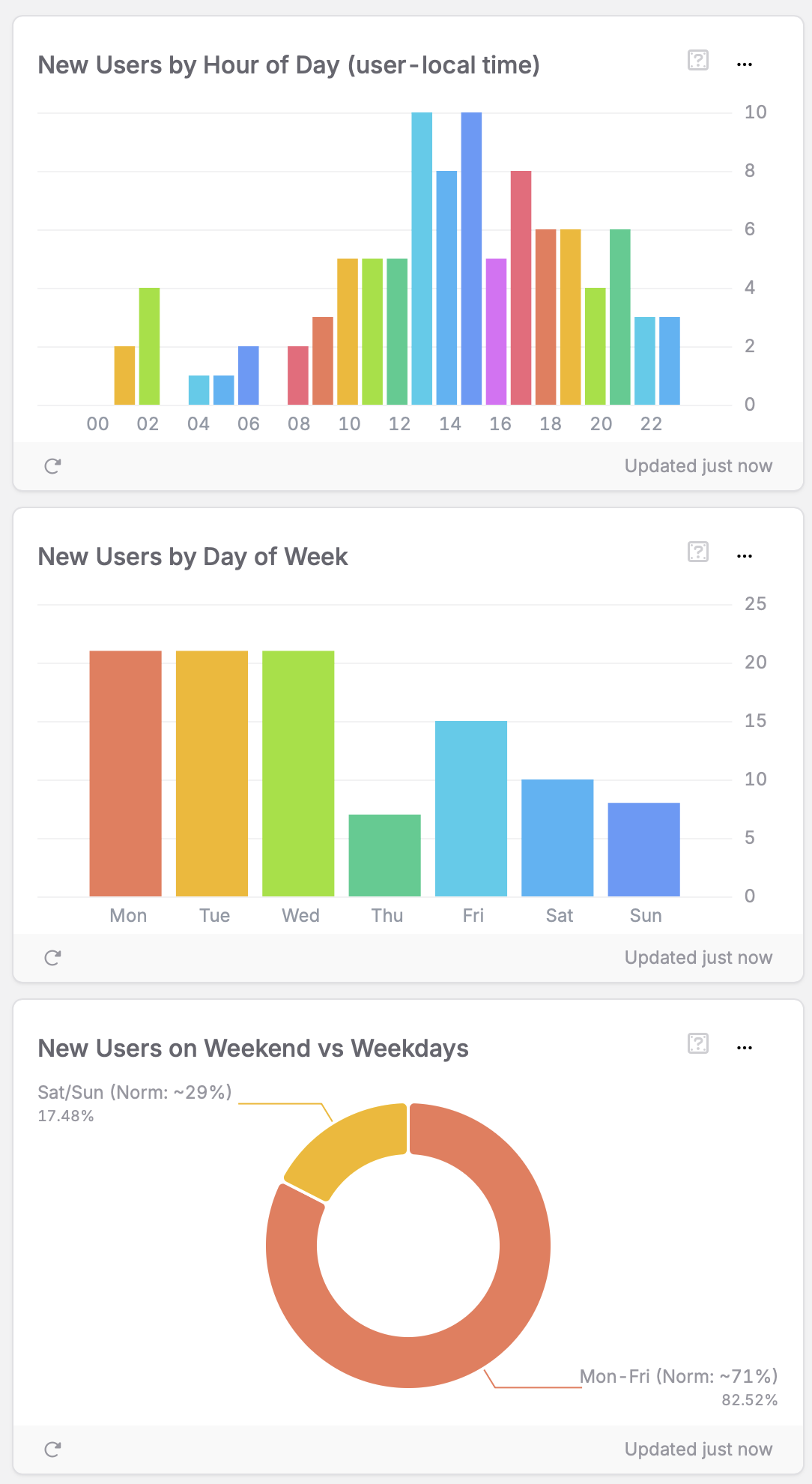
How to interpret the charts:
- Hour of day peaks: Show prime discovery times (user-local)
- Day of week trends: Reveal which days drive the most acquisitions
- Weekend vs. weekday balance: Indicates usage context (work vs. leisure)
Action example: The Hour of Day chart shows peak installations occur around 12pm–2pm with the highest activity at 1pm, followed by another strong period at 5pm–6pm. This suggests users are discovering your app during lunch breaks and after work hours. The Day of Week chart reveals significantly higher acquisition on Monday through Wednesday, with Thursday showing the lowest activity. Most notably, the Weekend vs Weekday chart shows only 17.48% of new users come on weekends (compared to the statistical norm of 29%), while 82.52% come on weekdays (above the norm of 71%). This strong weekday bias suggests your app may be more work-related or discovered primarily during business hours. Consider scheduling your marketing campaigns and social media posts for Monday through Wednesday mornings to capitalize on these patterns.
Recent temporal patterns
Questions you can answer:
- Are recent user acquisition patterns consistent with long-term trends?
- Have specific events or campaigns created temporary spikes?
- How can I differentiate between one-off events and genuine trends?
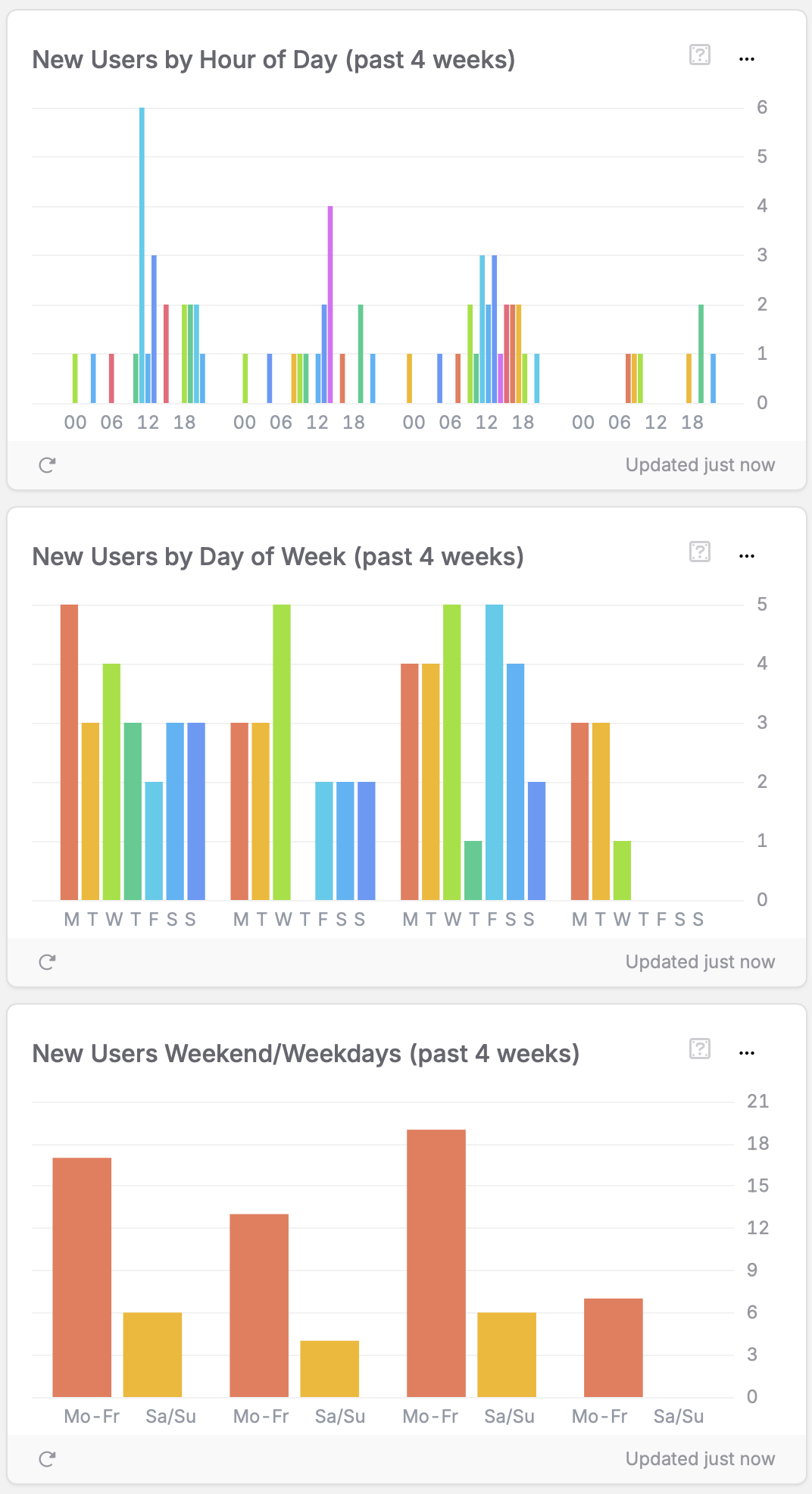
How to interpret the charts:
- Four-week hourly view: Identifies specific days with unusual activity
- Weekly pattern comparison: Shows consistency or variability week-to-week
- Recent weekend/weekday ratio: Confirms if the overall pattern holds true
Action example: Looking at the past 4 weeks data, we can see more granular patterns emerge. The Hour of Day chart shows a significant spike around noon on one particular day, which might represent a specific marketing event or feature launch rather than a consistent pattern. The Day of Week chart across 4 weeks shows variability, with some weeks showing strong Monday performance while others peak on Wednesday or Friday. However, the Weekend/Weekdays chart consistently shows weekdays outperforming weekends across all 4 weeks, confirming this is a reliable long-term trend rather than coincidental. When planning your marketing strategy, use the long-term data for general scheduling, but analyze these recent patterns to identify successful one-time events that could be replicated.
Device & platform distribution
Questions you can answer:
- What devices are my users using to access my app?
- Should I prioritize specific hardware or screen sizes?
- When can I safely drop support for older devices?
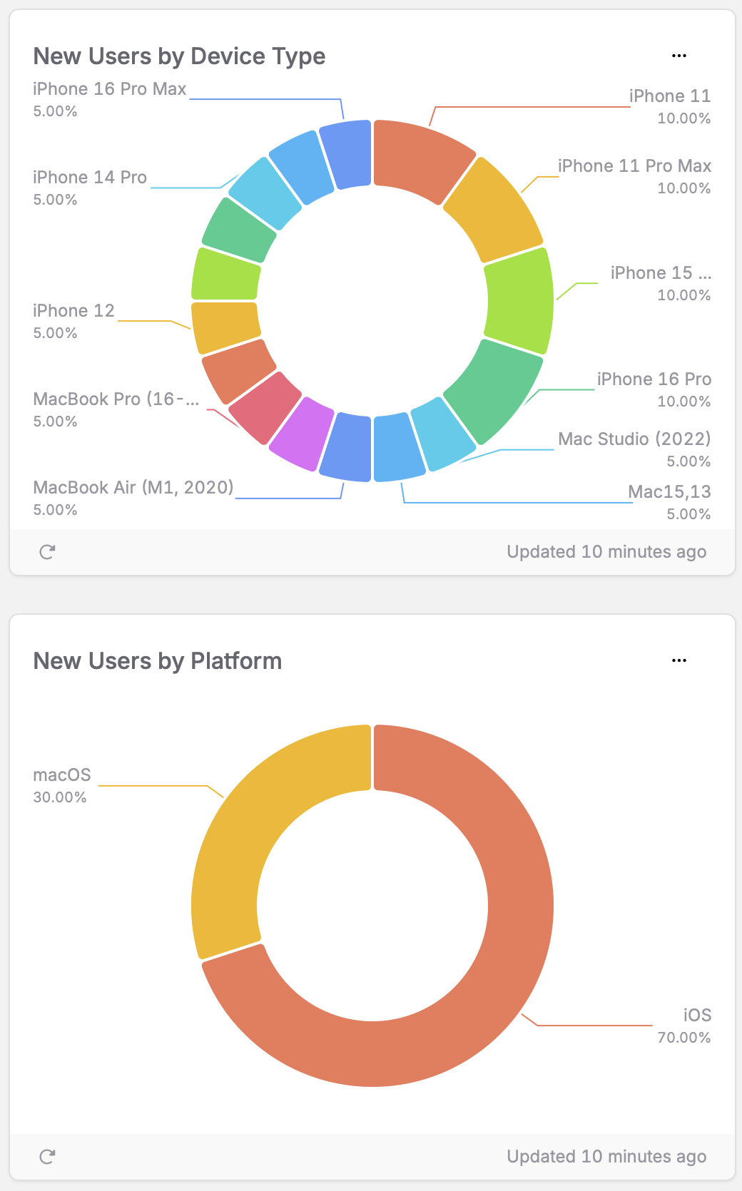
How to interpret the chart:
- Top device models: Prioritize testing and optimization for these devices
- Age of devices: Indicates how quickly your users upgrade hardware
- Platform distribution: Helps inform development priorities
Action example: The chart shows iOS devices account for 70% of your user base, with various iPhone models representing the majority of new users. iPhone 11, 11 Pro, 15, and 16 Pro each account for approximately 10% of acquisitions. This suggests you should prioritize testing on these devices and ensure your UI works well across both newer and slightly older hardware. The presence of older devices like iPhone 12 (5%) indicates you should maintain compatibility with devices from previous generations. With macOS representing 30% of users, cross-platform support remains important but iOS should be your primary focus.
Geographic & language distribution
Questions you can answer:
- Where are my users located geographically?
- What languages do my users speak?
- Which markets should I prioritize for expansion?
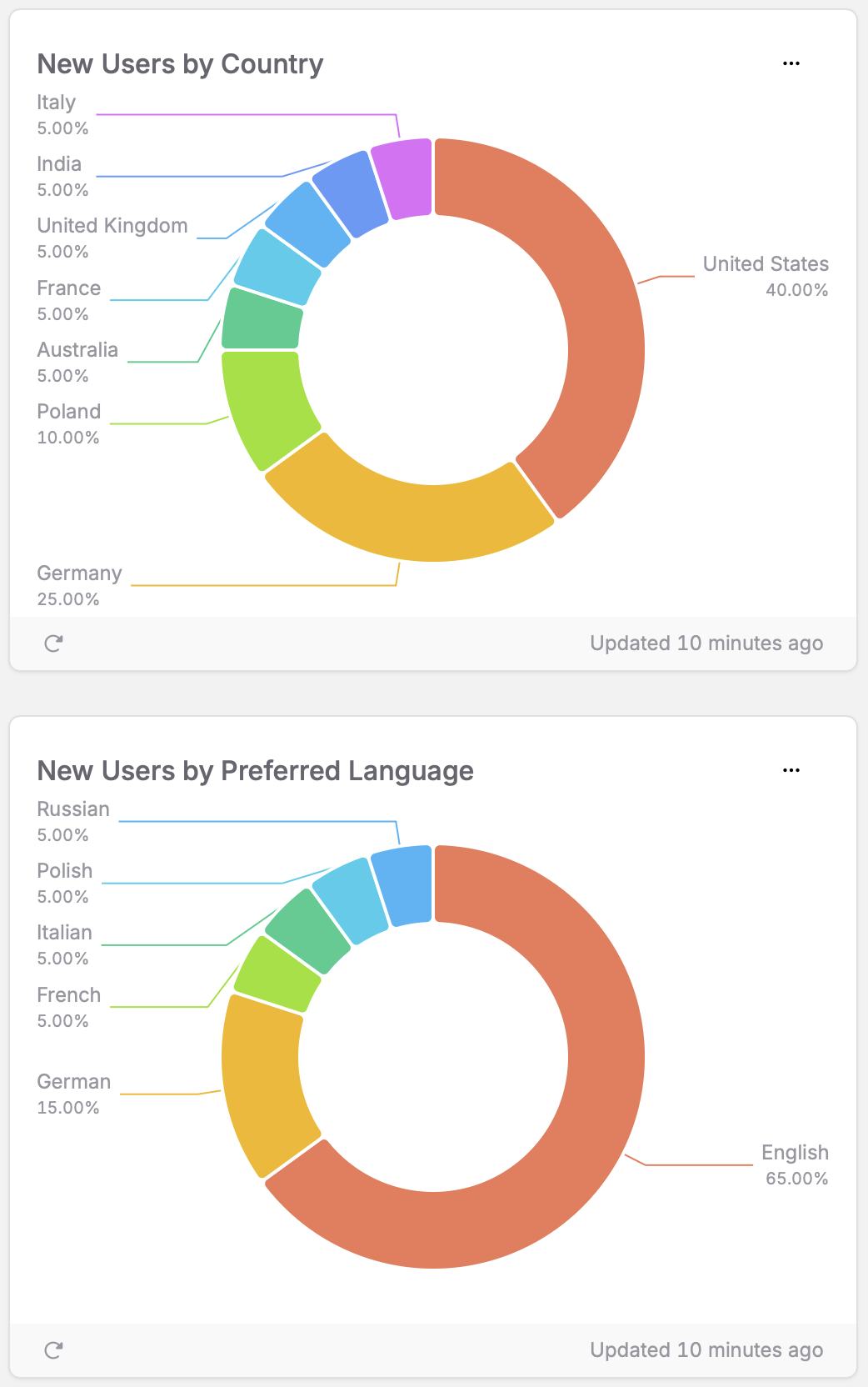
How to interpret the charts:
- Dominant regions: Countries with the largest segments indicate your strongest markets
- Unexpected regions: Emerging segments may represent untapped opportunities
- Language distribution: Helps prioritize localization efforts
Action example: Looking at the New Users by Country chart, you can see that the United States (40%) represents your largest market, followed by Germany (25%) and Poland (10%). The United Kingdom, France, Australia, India, and Italy each account for approximately 5% of your user base. This suggests you should prioritize these markets in your marketing efforts. The language distribution confirms that English (65%) should remain your primary focus, with German (15%) as a strong secondary language. The presence of French, Italian, Polish, and Russian (each at approximately 5%) suggests these could be considered for future localization efforts to expand your reach.
Making data-driven decisions
As you analyze your acquisition metrics, consider these key questions:
Marketing optimization
- When should you schedule campaigns based on your users’ discovery patterns?
- Which geographic markets show the strongest growth potential?
- How can you tailor your App Store presence for your most important regions?
Development priorities
- Which devices and platforms deserve the most testing attention?
- What language localizations would benefit the most users?
- Are there seasonal patterns that should influence your feature roadmap?
Growth opportunities
- Are there unexpected regions or user segments showing organic growth?
- Does your user acquisition align with your marketing efforts and spend?
- How can you optimize the first-time experience for your most common user profiles?
Remember that acquisition is just the first step in the user journey. Once you’ve optimized how users find your app, focus next on activation – ensuring they have a great first experience that turns them into engaged users.
