
View this page as Markdown • #docs #articles #notebooks #insights #how-to #features
A Practical Guide to Notebooks
Notebooks combine live charts with your analytical thinking, helping you preserve context and momentum in your investigations. This guide shows you how to use them effectively, from basic setup to advanced techniques.
Getting started with Notebooks
Notebooks are your analytics lab notebook – a place where you can document your findings, share insights with your team, and maintain context throughout your investigations. Let’s explore how to use them effectively.
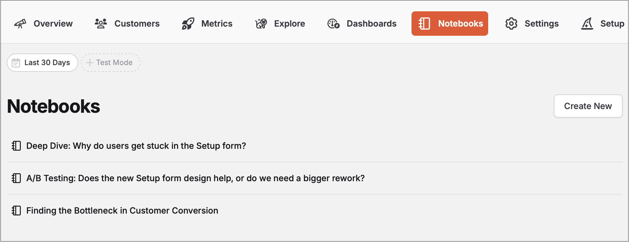
Creating your first notebook
- Open the Notebooks tab in your TelemetryDeck dashboard
- Click “Create New”
- Give it a clear, descriptive title
- Start writing your analysis using markdown
Adding charts to your notebook
The easiest way to add charts is using the “Copy TQL” button:
- Create your chart in the TelemetryDeck Dashboard
- Click the “Actions” menu
- Select “Copy TQL”
- In your notebook, create a code block marked as
tqland paste the query:
```tql
{
  // Your chart's TQL query will be here
}
`` `You can customize how your data is displayed using the displayMode value in your TQL:
lineChart- Perfect for trends over timebarChart- Great for categorical comparisonspieChart- Best for proportional dataraw- Ideal for detailed breakdownsfunnelChart- Essential for conversion analysis
Using Markdown effectively
Notebooks support all standard markdown features:
- Headings (
#,##, etc.) – Structure your analysis into clear sections - Lists (
-or1.) – Break down steps, findings, or requirements - Code blocks (```) – Share TQL queries or technical details
- Images (
) – Add screenshots or diagrams - Blockquotes (
>) – Highlight important insights or tips - Tables – Compare data or list requirements
Sharing your findings: Public Snapshots
Notebooks can be published as public snapshots – shareable reference documents that preserve your findings exactly as they were when you published them.
How it works
When you publish a notebook, TelemetryDeck creates a snapshot that freezes your data at that moment:
- Click “Publish Snapshot” to make your notebook publicly accessible
- All TQL queries are processed and results saved into the snapshot
- Data is frozen – charts show exactly what you saw at publish time
- You get a unique, private URL that only people with the link can access
Publishing workflow
- First publish: Click “Publish Snapshot” to create your public version
- Updates: Button changes to “Update Snapshot” – creates fresh data and replaces the old snapshot
- Managing: Use the link icon to visit your public page, “Copy Public Link” to share, or “Unpublish” to remove access
- Mulitple versions: Simply “Duplicate” your notebook if to keep the old published analysis and publish the new one when it’s ready
Why snapshots matter
Freezing data ensures your written insights stay meaningful over time. When you reference specific numbers in your analysis, they’ll always match the charts – perfect for:
- Team documentation that won’t become outdated
- Task requirements and project briefs with reliable data context
- Client reports with consistent, reliable data
- Reference materials for future investigations
- Articles or presentations where data accuracy matters
Putting it all together: a real-world example
Now that we’ve covered the basics, let’s see how notebooks work in practice. We’ll walk through an example of analyzing an app’s Onboarding flow, showing how notebooks help maintain context long-term.
Setting up the analysis
Define the Question
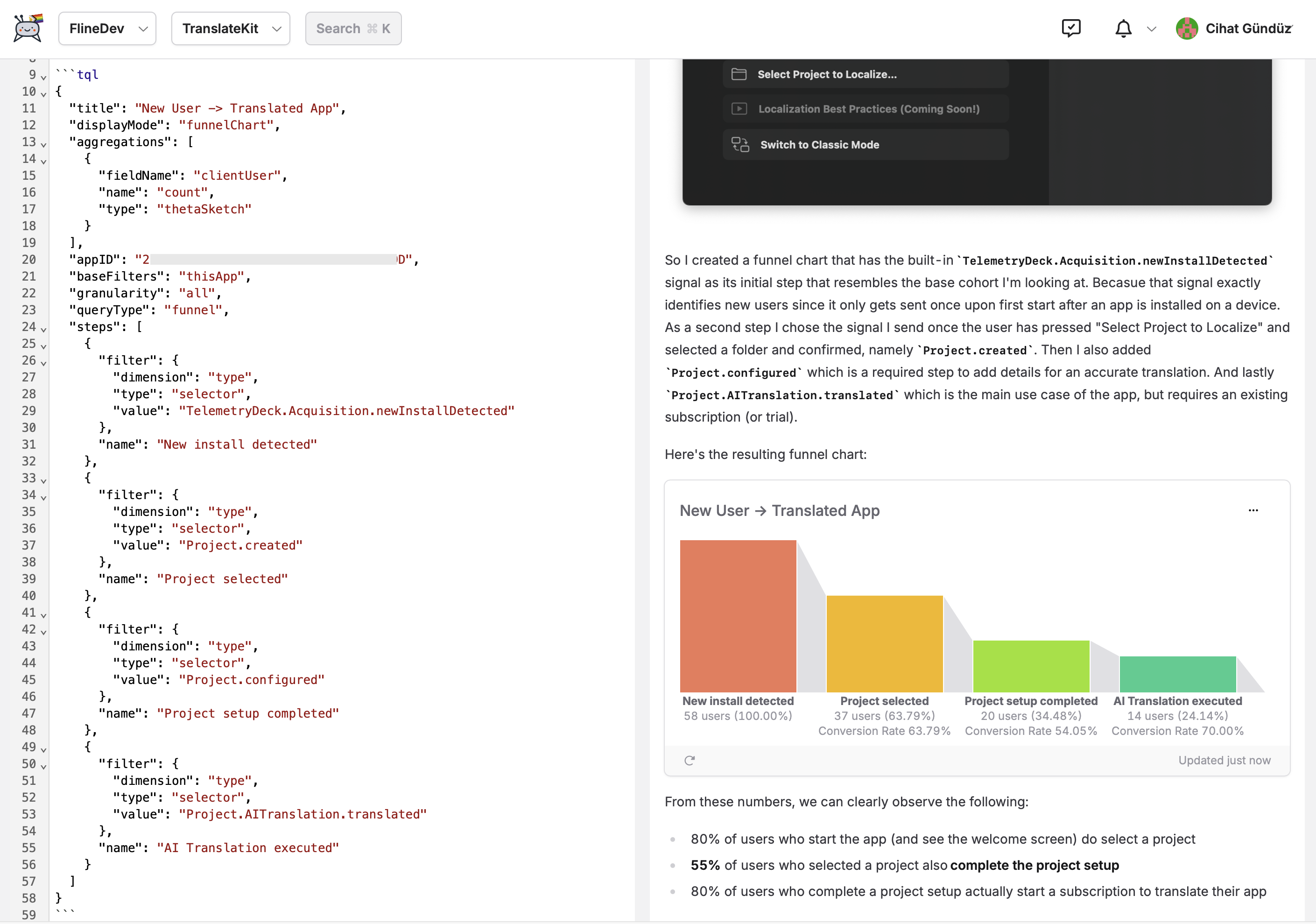
# Onboarding flow analysis
Question: How well does our app convert installations into paying customers?
Hypothesis: The welcome window might be causing issues due to its similarity to Xcode's welcome screen.
Create the Funnel Chart
- Use the dashboard to create a funnel chart
- Click “Copy TQL” to get the query
- Add it to your notebook with context:
## User journey analysis
Let's track the complete user journey from installation to first successful value delivery:

<paste TQL here>
Document Findings
## Initial results
- 80% of users proceed past welcome screen
- 55% complete setup step ⚠️
- 80% convert after setup

Key Insight: Welcome window isn't the problem. The real bottleneck is the setup step.
Plan Next Steps
## Next investigation
To understand why users drop off during setup, we need to track:
- [ ] `Onboarding.SetupStep.started` - When users begin the setup process
- [ ] `Onboarding.SetupStep.completed` - When users finish setup
- [ ] `Onboarding.SetupStep.abandoned` - When users leave without completing
- [ ] `Onboarding.SetupStep.duration` - How long users spend in setup
Maintaining context over time
The real power of notebooks becomes apparent during long-running investigations. As you wait for new data, your notebook serves as a living document that:
- Preserves Your Thinking – Document your hypotheses/assumptions
- Tracks Progress – Note what data you’re waiting for and why
- Prepares for Analysis – Set up charts that will show data when it arrives
- Shares Knowledge – Help team members understand the context
This approach ensures you can pick up right where you left off when new data arrives, rather than starting from scratch.
Common use cases
Notebooks excel in several scenarios:
Performance Investigation: When tracking down issues, combine error logs with performance metrics in one place. Document your hypotheses, track implementation progress, and update findings as new data arrives.
Team Communication: Create weekly product health reports or onboard new team members by showing your notebooks. The combination of live charts and explanatory text makes it easy to convey complex insights.
Feature Analysis: Compare user behavior across versions or track feature adoption over time. Notebooks help you maintain context throughout the analysis, from initial hypothesis to final implementation.
Long-Running Investigations: Perhaps most importantly, notebooks help you maintain momentum during investigations that span weeks or months. Document what you’re waiting for, prepare your analysis structure, and dive back in as soon as new data arrives.
Ready to level up your analytics workflow? Open the Notebooks tab and start exploring your data in a more structured, insightful way – and share your discoveries with confidence!
Related resources
Understanding Insights
Learn how insights work and how to create effective visualizations for your notebooks.
TQL Query Language
Master the query language that powers notebook charts and enables advanced analytics.
Creating Funnel Charts
Learn how to track user conversion through multi-step processes – a key technique for notebook analyses.
Privacy FAQ
Understand how TelemetryDeck's privacy-first approach aligns with the data minimization strategy notebooks encourage.