
Ahoy! Discover the "aha moments" with our new Activation Dashboard ⚓
The second sail is hoisted! Our new Activation Dashboard reveals when users truly connect with your app – automatically tracking those crucial first experiences that turn curious installers into engaged users.

Ever launch a feature and wonder "is anyone actually using this thing?" As indie developers wearing multiple hats, the last thing we need is becoming data scientists just to understand our onboarding.
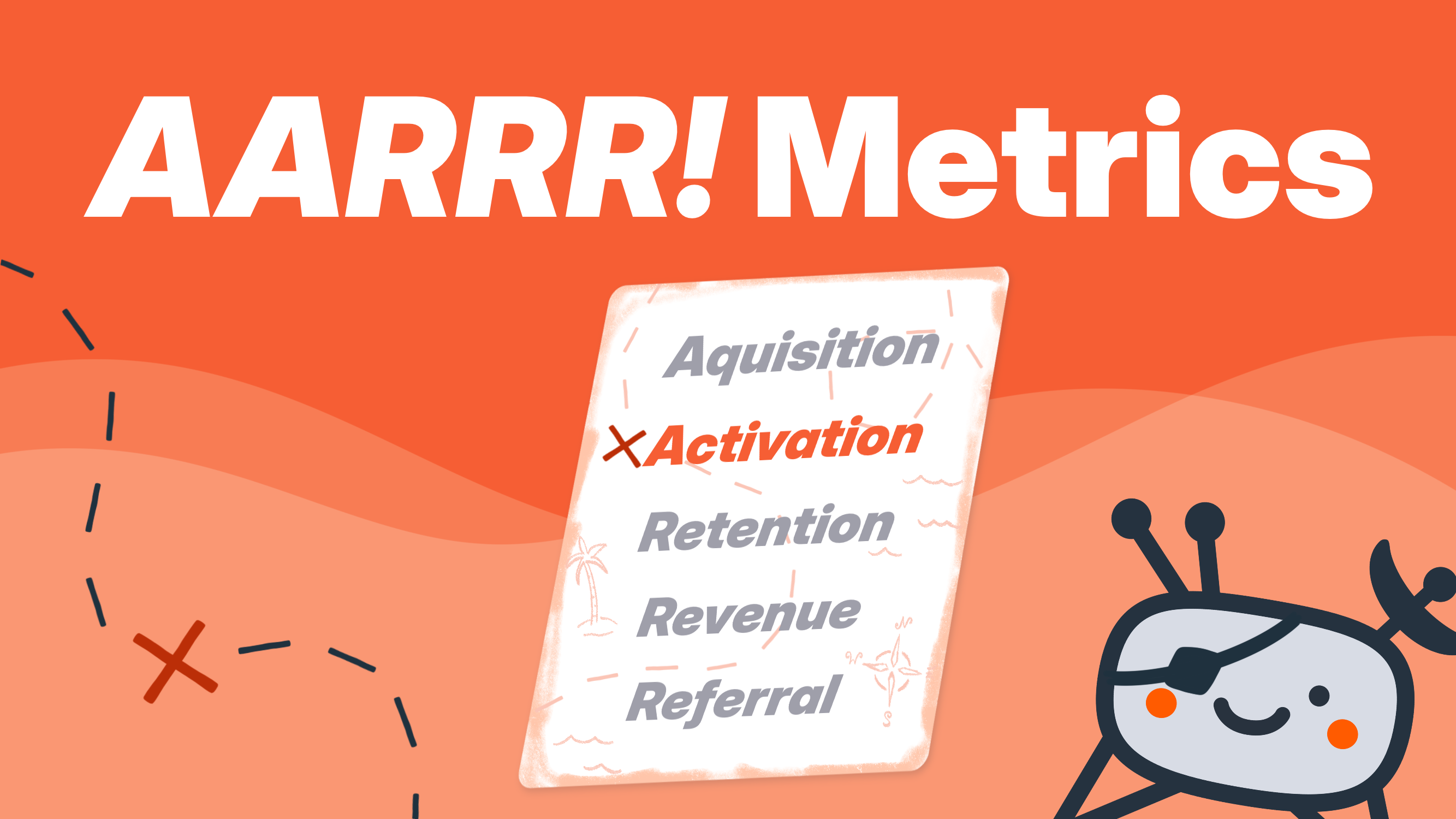
The second "A" in "AARRR" is here
Acquisition gets users to your shores, but activation? That's when they discover the treasure. It's the moment users realize "oh, THIS is why I need this app" – and it happens faster than you think.
The AARRR framework puts activation right after acquisition because it's make-or-break time. Users who experience your app's core value in their first sessions become the foundation of everything that follows: retention, referrals, and revenue.
Our Activation Dashboard doesn't just count activated users. It reveals the patterns, timing, and conditions that lead to those magical "aha moments."
Your map to user enlightenment
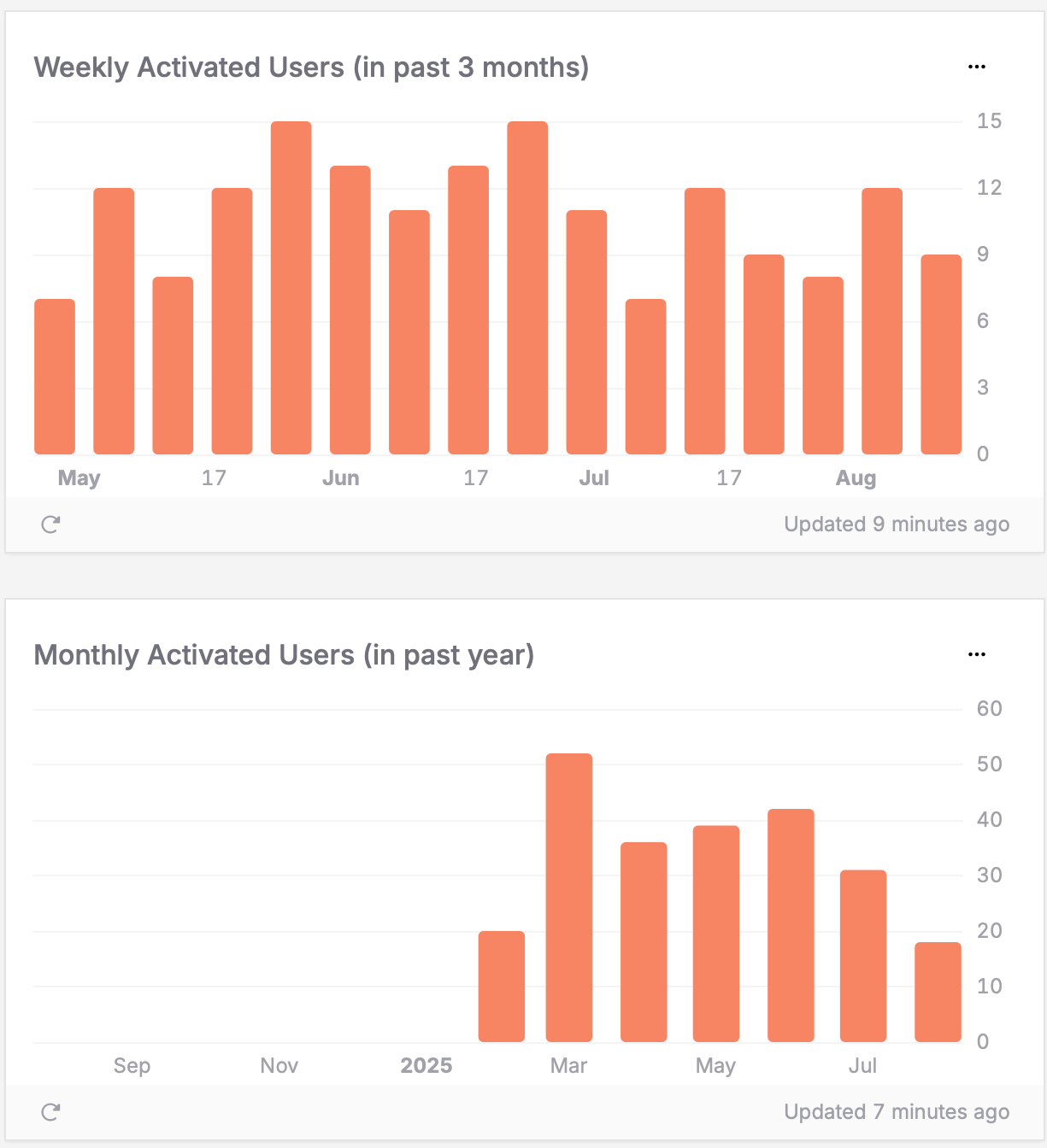
Activated user growth trends
Our dashboard tracks daily, weekly, and monthly patterns that reveal whether your onboarding is working. Watch for consistent upward trends (onboarding success!) or sudden spikes from app improvements. The hourly view lets you validate recent changes immediately.
Activation time patterns
Here's what blew our minds: users don't just randomly stumble into activation. There are patterns to when people have the focus and motivation to truly explore your app.
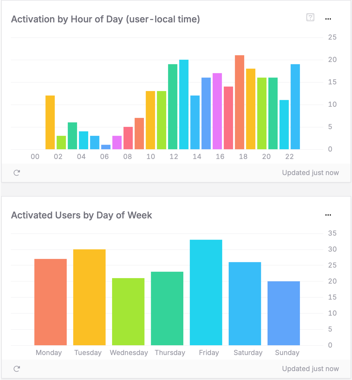
Our dashboard reveals exactly when users experience your app's value – down to specific hours and days. Some apps peak during lunch breaks, others on weekend mornings. Time your local onboarding reminder notifications for maximum impact.
Device, platform & geographic patterns
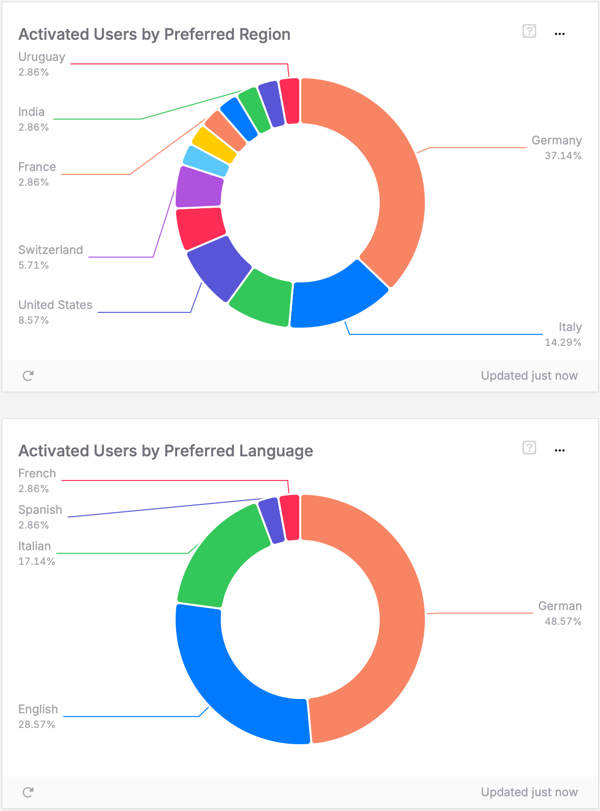
iPhone users activating faster than Android? iPad users struggling in certain regions? Some markets showing higher activation rates due to local needs while others reveal localization opportunities? These combined insights guide your optimization focus across both hardware and geography.
The treasure was here all along
The beautiful part: If you've updated to SDK 2.8.0+ (Swift), 6.0.0+ (Kotlin), or 2.3.0+ (Flutter) since April, your activation insights are already waiting in your dashboard.
No additional code. No configuration. No learning query languages. TelemetryDeck has been automatically collecting this data since April 2025 – just navigate to your dashboard to see it!
What's next
The Activation Dashboard is the second of five AARRR dashboards, joining our existing Acquisition Dashboard. Coming soon: Retention, Referral, and (improved) Revenue dashboards.
Each follows our philosophy: sophisticated analytics made simple, with automatic data collection built into our SDKs.
Ready to explore?
Navigate to the Customers tab in your TelemetryDeck dashboard and explore the new Activation section. Watch the patterns emerge and start optimizing those crucial first experiences.
For deeper insights, check out our activation analytics guide and Pirate Metrics introduction.
Time to turn curious visitors into committed users – your app's treasure awaits discovery! ⚓