
#docs #basics #setup #basics #pirate-metrics #activation
Activation Analytics
Activation is the second stage of the Pirate Metrics framework. It shows the moment users feel your app’s core value for the first time. TelemetryDeck tracks these patterns automatically. This helps you improve the first sessions that turn new users into engaged users.
What is User Activation?
User activation is the key moment when users first feel your app’s core value. It’s the “aha moment” that turns curious installers into engaged users.These metrics show how well your onboarding works. They help you find friction and improve the first-time experience.
With TelemetryDeck’s Activation dashboard, these insights are automatically collected and visualized. No additional code required. Please update to SwiftSDK 2.8.0 / KotlinSDK 6.0.0 or later.
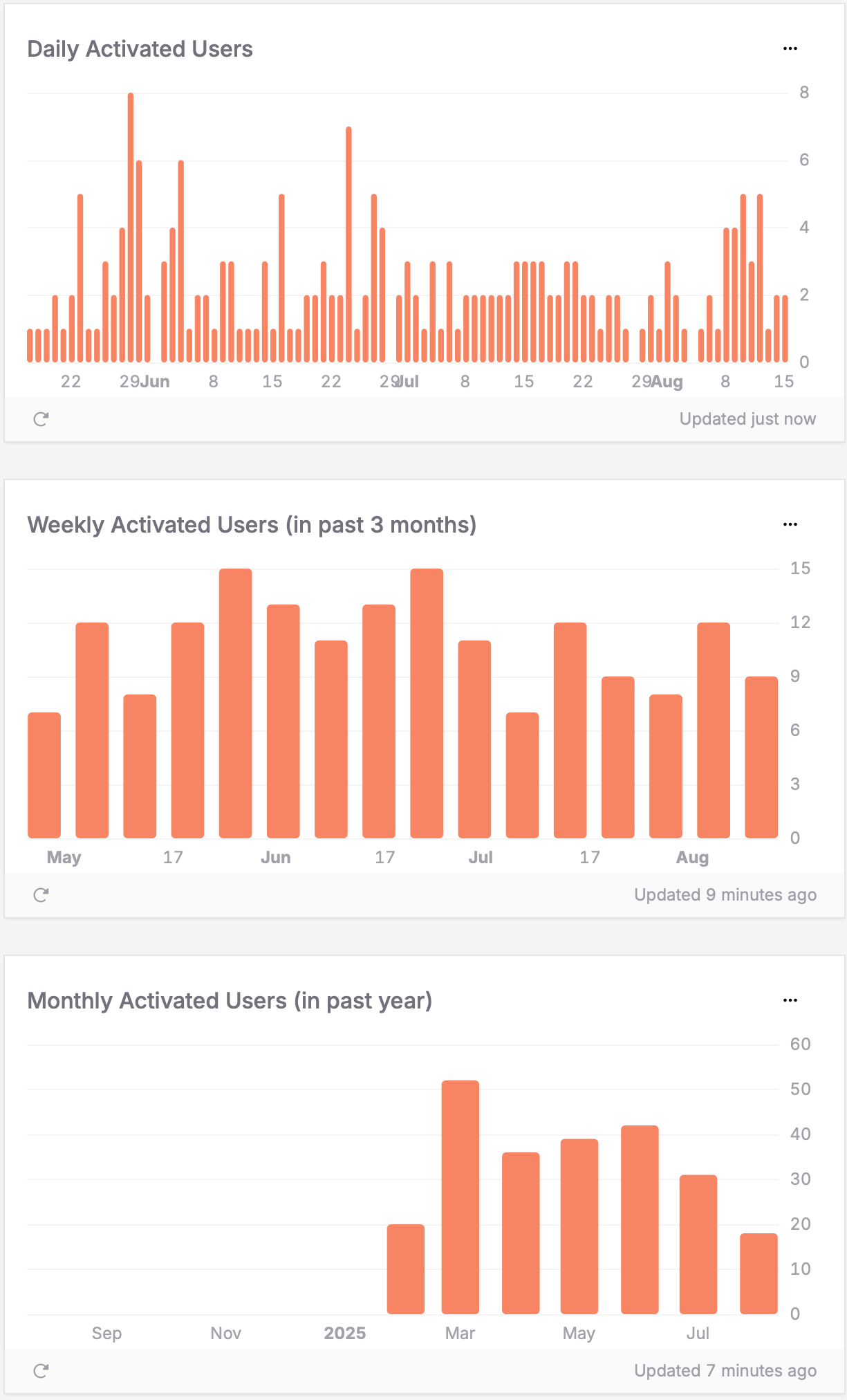
Activated user growth trends
Questions you can answer:
- How many users are experiencing my app’s core value?
- Are my activation rates improving over time?
- How effective is my onboarding experience?
- What are the immediate activation patterns in the last 24 hours?
How to interpret the charts:
- Hourly (last 24h): Shows recent activation activity and immediate trends – useful for spotting issues or validating recent changes
- Daily patterns: Consistent upward trend indicates your Onboarding is working well; sudden spikes may correlate with improvements or campaigns
- Weekly/Monthly trends: Reveal longer-term activation health and seasonal patterns
- Declining trends: May indicate Onboarding friction, confusing first experiences, or performance issues
How to read your data: In this example dashboard, the monthly chart shows activation growing over time. It peaks around March–April with more than 50 users. This suggests the activation strategy is working well. The weekly data is more stable, with about 12–15 users. Daily numbers vary more, from 1 to 8 users with occasional spikes. This looks like normal variation, not a deeper problem. Use the hourly chart to check onboarding changes right away. If activation drops after a release, investigate immediately.
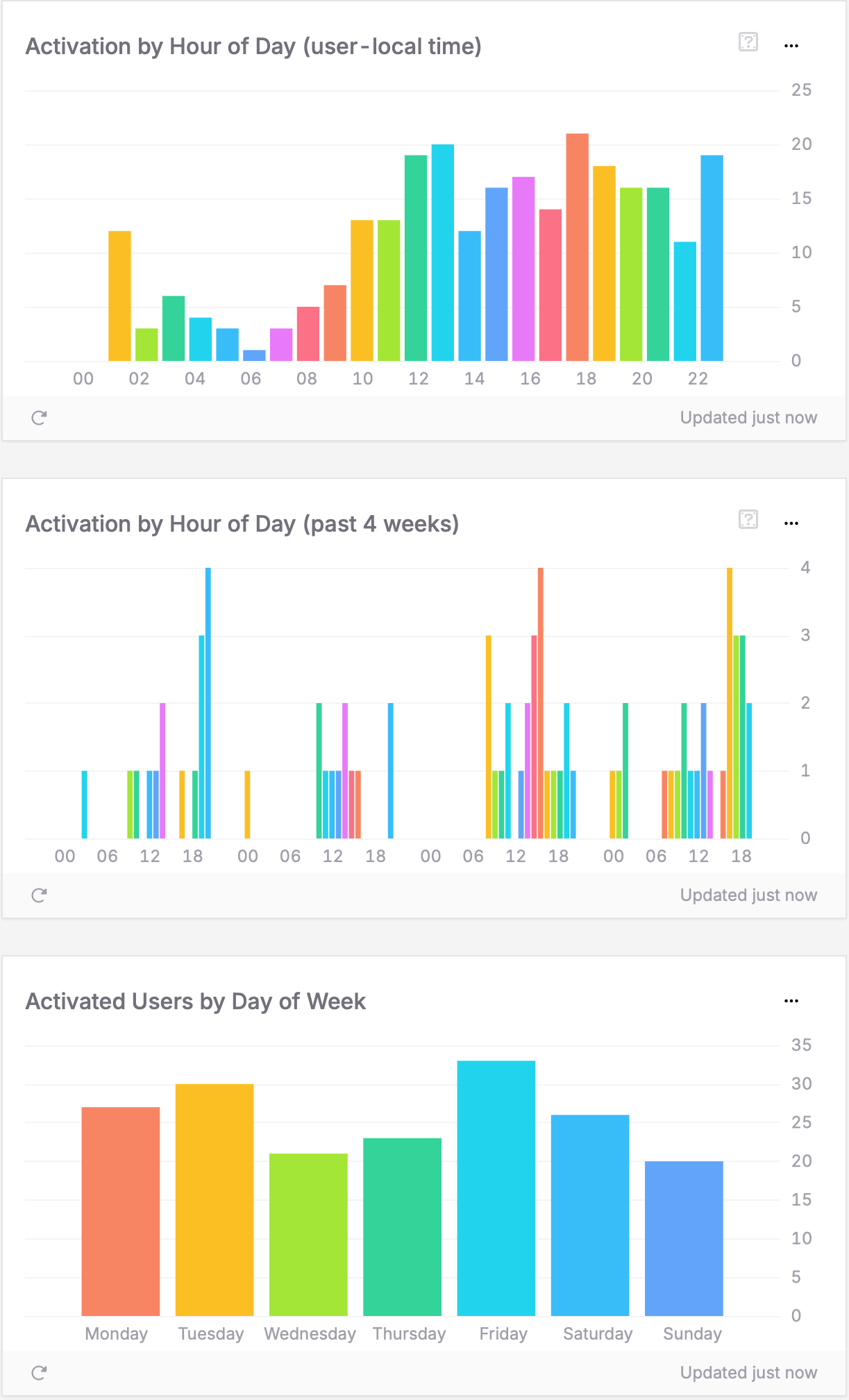
Activation time patterns
Questions you can answer:
- When during the day do users typically get activated?
- Which days of the week see the most successful first experiences?
- Do weekdays or weekends provide better conditions for user activation?
- Are recent activation patterns consistent with long-term trends?
How to interpret the charts:
- Hour of day patterns: Show when users have time to properly explore your app (user-local timezone)
- Day patterns (past 4 weeks): Reveal specific days with exceptional activation performance
- Weekend vs. weekday balance: Indicates whether activation requires focused time or fits into busy schedules
- Recent trends: Help identify if timing patterns are changing over time
How to read your data: IIn this example, the Hour of Day chart shows activation peaks around 12–1 PM and 5–6 PM. This suggests users activate during lunch breaks and after work, when they have time to focus. The Day of Week chart shows Friday with the highest activation (34 users). Sunday has the lowest (21 users). This points to a clear weekday preference. If you see similar patterns, users likely reach your app’s core value during structured times. You can then time onboarding prompts and feature hints for weekday lunches and early evenings, when engagement is highest.
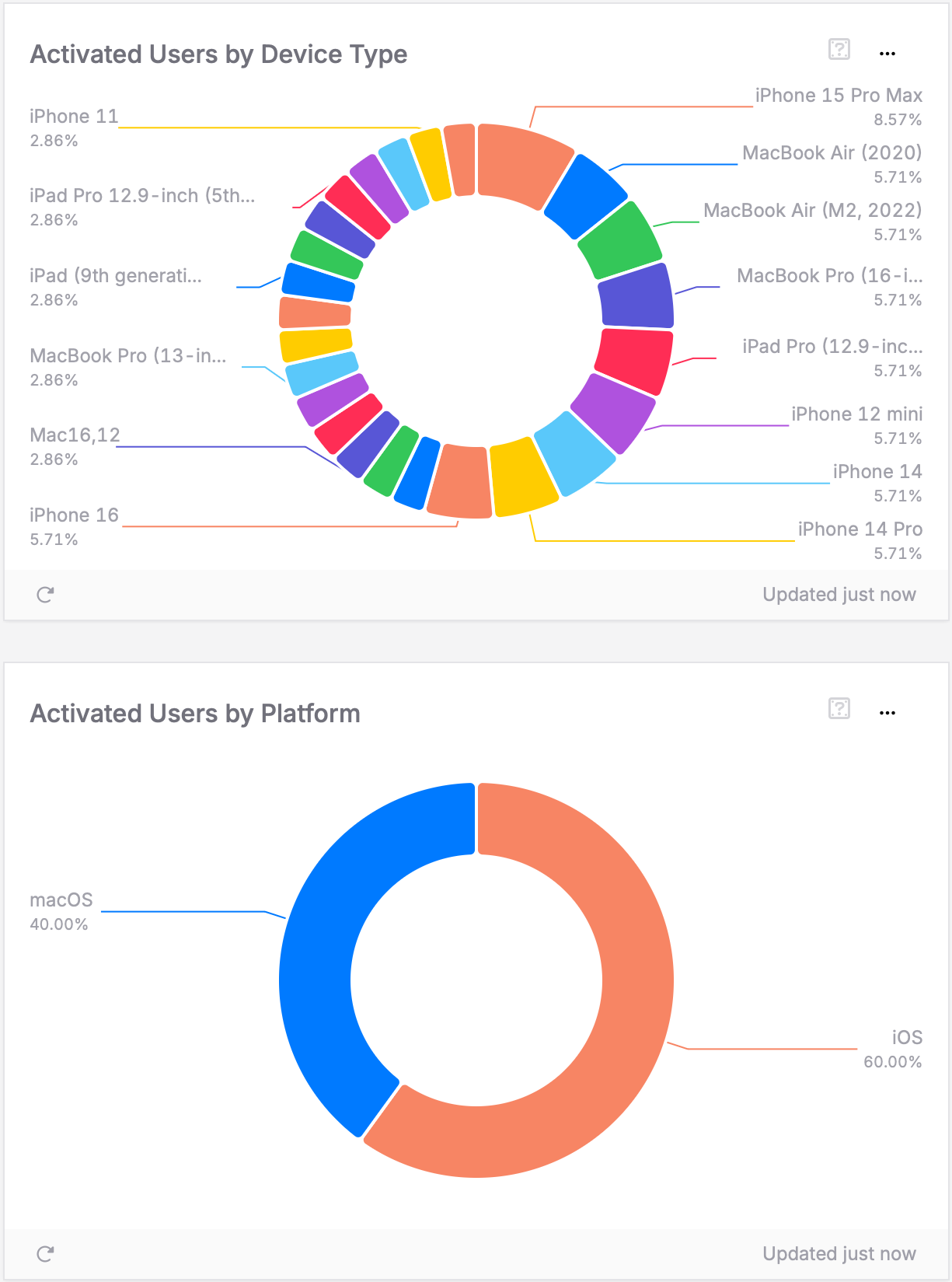
Activation by device & platform
Questions you can answer:
- Which devices provide the best activation experience?
- Should I optimize my Onboarding for specific hardware or screen sizes?
- Are there platform-specific activation barriers?
How to interpret the chart:
- Top-performing devices: These provide the best activation experience – understand why
- Low activation devices: May have UI issues, performance problems, or usability challenges
- Platform differences: iOS vs. Android vs. other platforms may have different activation patterns
How to read your data: In this example, iOS users make up 60% of activated users. macOS users account for the remaining 40%. The iPhone 15 Pro Max leads with 8.57% of activations. Several other models follow at about 5.71% each. This fairly even split suggests onboarding works well across devices. A strong secondary platform, like macOS here, points to successful cross-platform activation. If your data looks similar, focus testing on the most common devices. At the same time, keep activation quality high across all platforms.
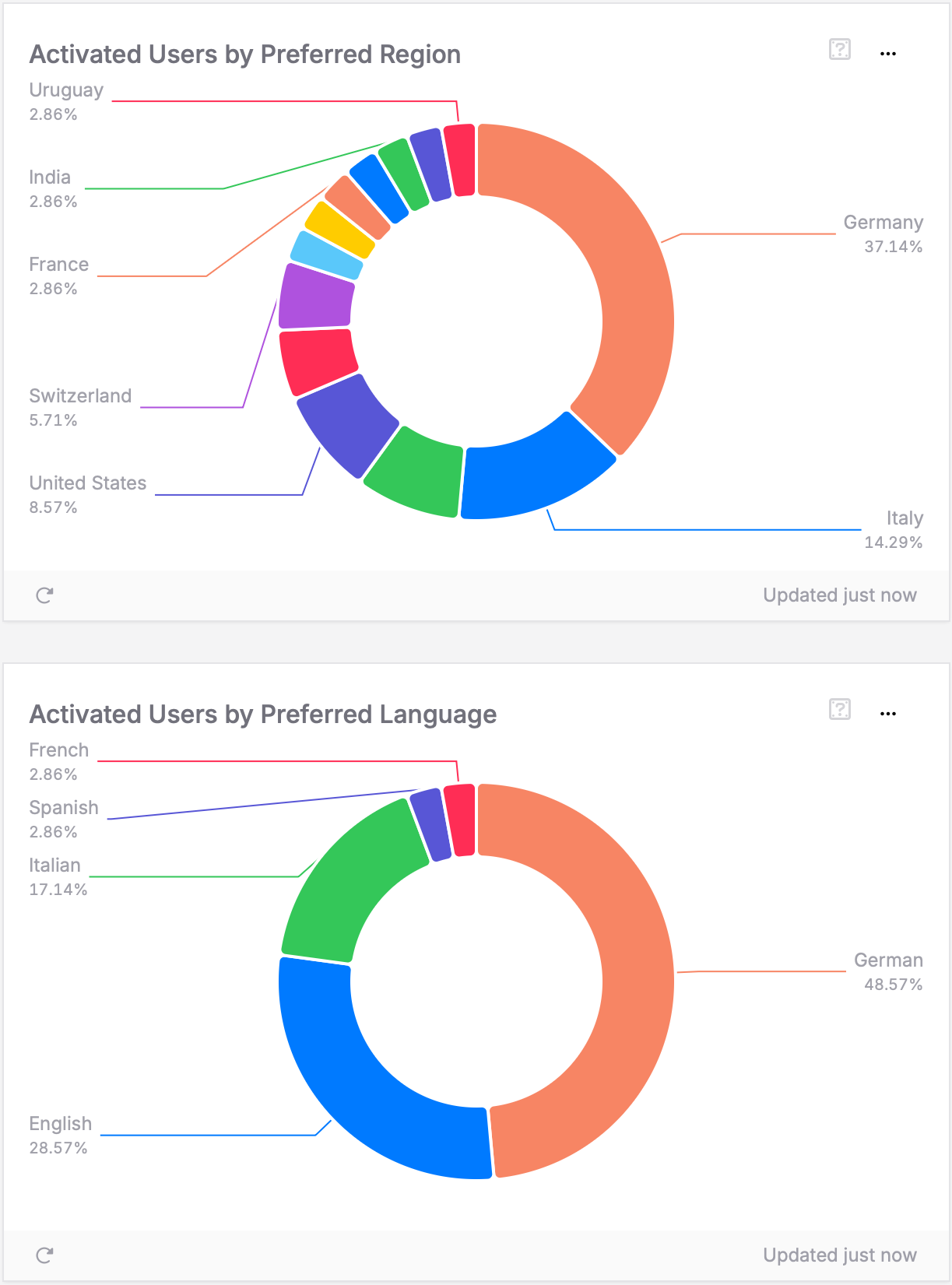
Activation by geography & language
Questions you can answer:
- Where are users most successfully experiencing my app’s value?
- What languages correlate with higher activation rates?
- Which markets provide the strongest foundation for growth?
How to interpret the charts:
- Strong activation regions: Countries where users consistently experience your app’s value
- Emerging markets: Regions with growing activation that may warrant localization investment
- Language correlation: Languages that correlate with successful activation experiences
How to read your data: In this example dashboard, Germany is the strongest activation market at 37.14%. Italy follows with 14.29%, and the United States with 8.57%. The language data shows German users at 48.57%. English users follow at 28.57%, with Italian at 17.14%. These patterns suggest onboarding works best for certain languages. You can use this insight to focus localization on your top regions. This helps maximize activation where it already performs well.
Taking action on activation insights
To improve activation, ask the right questions. Form clear and creative ideas about what your data shows. Look beyond obvious metrics. Combine insights from time, location, and device data to find new opportunities. Activation is the base for retention. Users who feel your app’s core value early are more likely to stay, engage, and support long-term growth.