
Why our analytics service has a cute mascot (and why that matters)
Let’s be honest for a second: analytics isn’t exactly exciting. It’s numbers, dashboards, funnels, and retention bars. Important, precise, and sometimes exciting. Yes, they can be fun, but sometimes it’s easy to forget that behind every amazing product, every metric, and every event, there are people: users, decisions, and emotions.

TelemetryDeck changed its mascot. In this post we share the process.
We wanted to ensure our analytics could use a bit of personality. Because behind every product, every metric, every event, there are people: users, decisions, emotions. So we asked ourselves, what would analytics look like if it actually felt human?
From Mascot to Identity
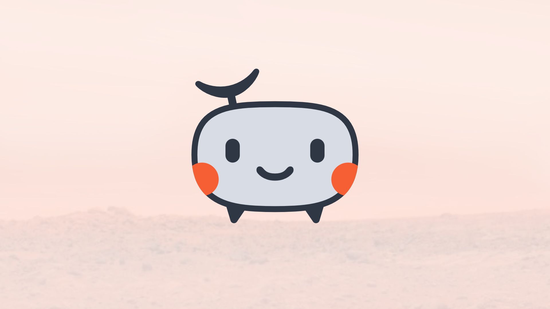
If you’ve been following TelemetryDeck for a while, you’ve probably seen Sondrine, our little space probe-like mascot. Originally, Sondrine was just that: a cute companion next to a more traditional logo. But over time, something changed. We realized this character actually represents what we do: it travels through your app, collects signals, and helps you understand what’s going on. So instead of keeping it separate, we decided to bring it closer to the core of our brand—not just as decoration, but as part of our identity.
The Design Problem Nobody Talks About
Here’s the thing most people don’t see: designing a logo isn’t just about how it looks; it’s about how it behaves. Our original mascot was charming, but it had issues. It was too detailed and broke down at small sizes; thin lines looked messy on some screens, and complex shapes were difficult to print, cut, or reuse. In real-world usage, it just didn’t hold up. And since we use our logo everywhere, from the dashboard UI and website header to stickers and T-shirts, we needed something more robust.
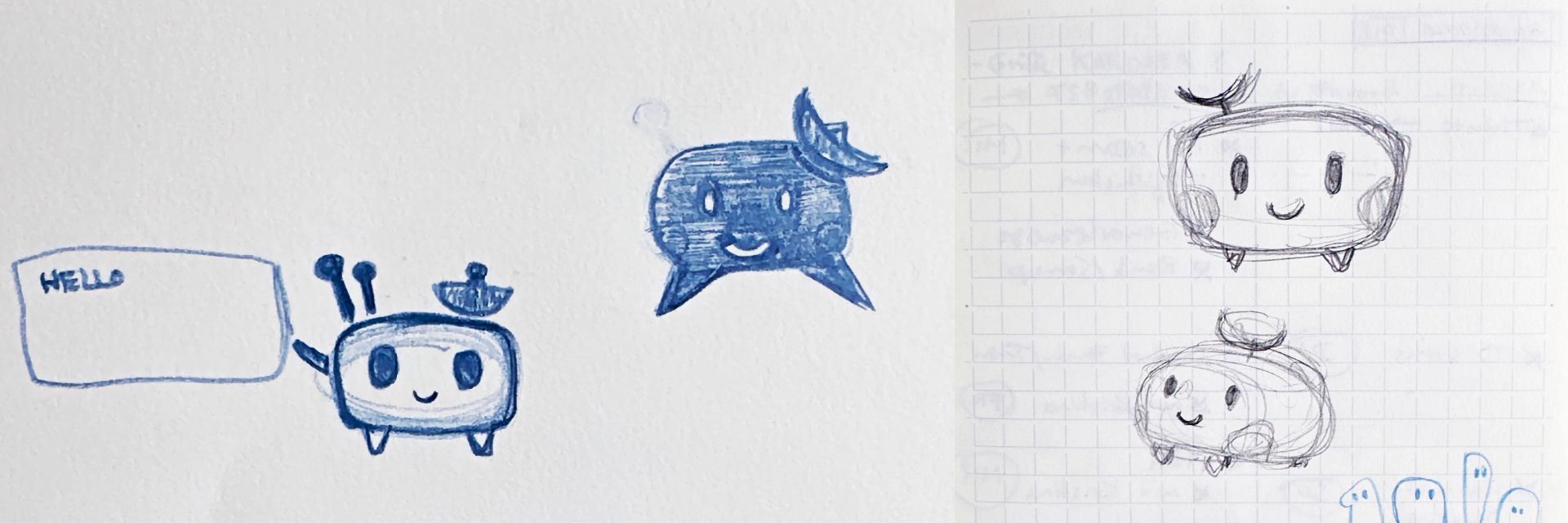
The old Sondrine:

Radical Simplification
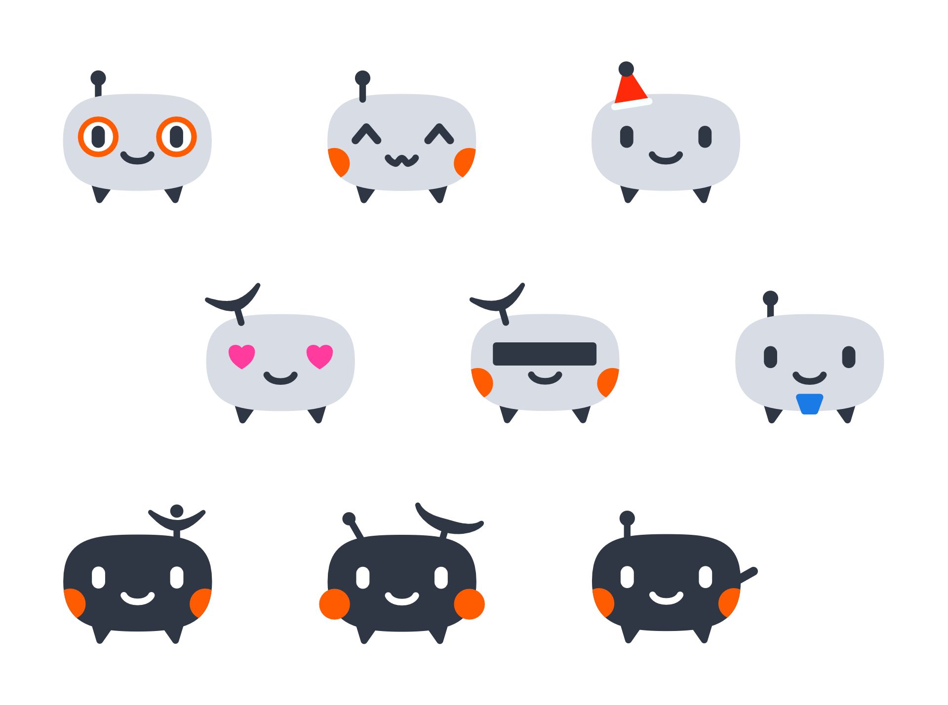
The solution was to strip it down, radically. No tiny legs, no fragile details, no unnecessary complexity: Shrink the landing gears and fragile antennas, condensing the complexity into simpler shapes. What remained was a simple idea: a soft, rounded blob shape. Blobs are readable, flexible, and, surprisingly, lovable.
From there, we rebuilt the character using what you could call the "Principles of Cuteness." Bigger eyes create more emotional connection, clear shapes improve readability, and minimal features allow for maximum flexibility.
So cute that you want to scream
No, you’re not alone. Yes, there is a real psychological concept called "cute aggression." The feeling when something is so adorable you can’t handle the emotions. That is what we aimed for, and yes, we intend to make a plushie someday.
Because we are working in a space that is complex, abstract, and often boring,
We chose the opposite direction instead of adding more complexity. We focused on making it approachable, friendly, and cute.
Against the meme that haunts tech right now
There is another reason we leaned in this direction. If you look at modern tech logos, especially in AI, they all start to look the same. Smooth gradients, circular shapes, abstract, safe, and slightly anonymous. There is even a blog post titled “Why every AI company’s logo looks like a butthole.” Not our words, but not wrong either. We did not want that. We wanted something with personality.
Designed for Real Life (Not Just Figma)
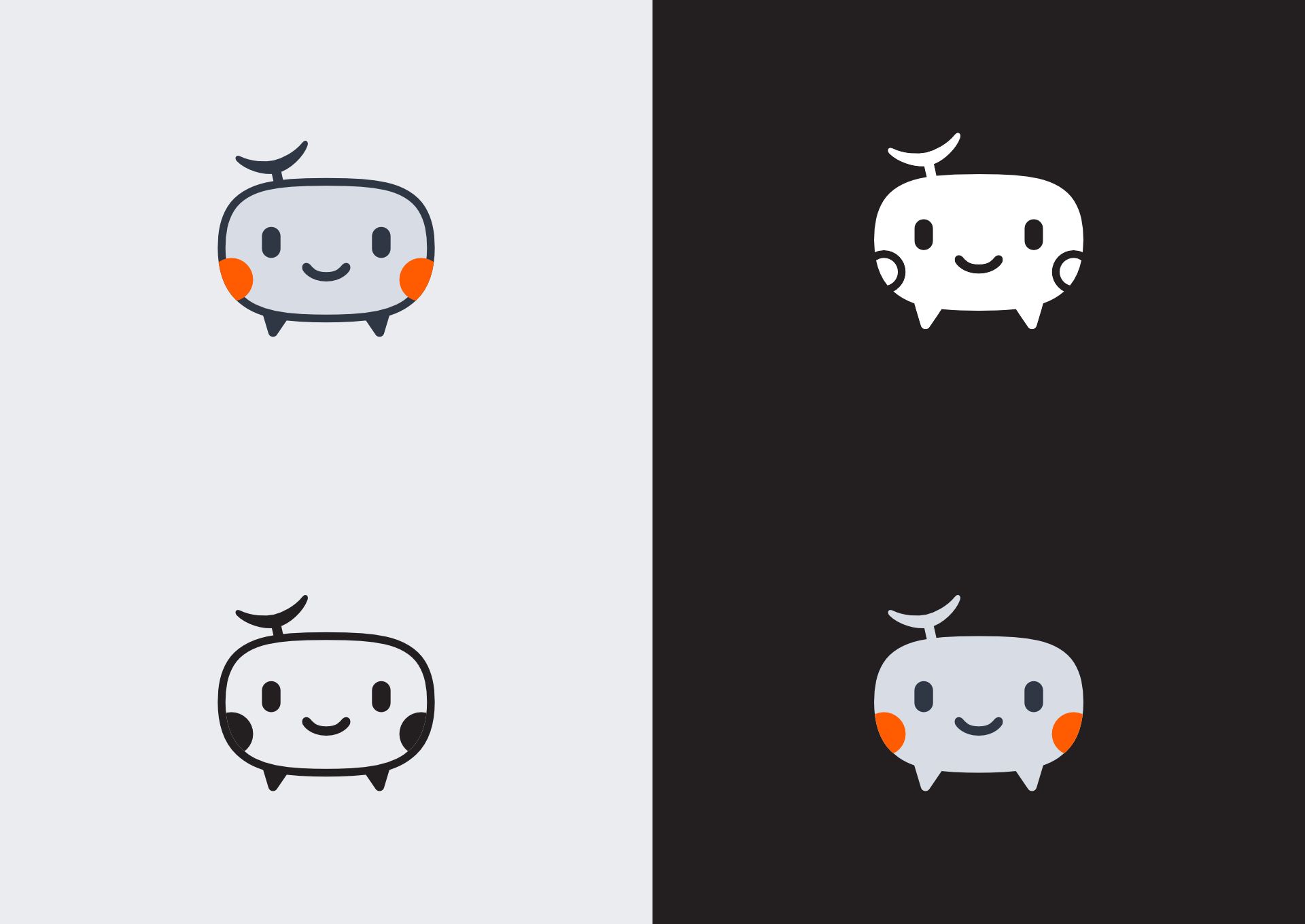
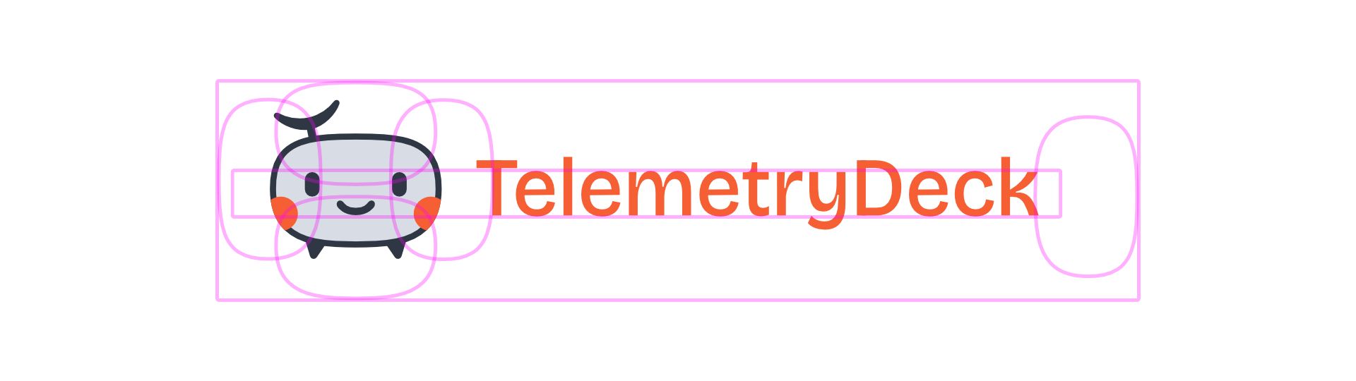
One of our internal tests for good design is surprisingly simple: can we turn it into a stamp? If a logo works as a stamp, it usually works everywhere. It survives scaling, prints cleanly, and does not fall apart. The new Sondrine passes that test, and because it is so simple, it unlocks something even more interesting:
A System, Not Just a Logo
Once the base shape worked, something fun happened. We could start playing with it by adding different expressions, accessories, and variations. A blue beard, heart eyes, or even a censored version all became possible. That is the power of simplicity. It turns a logo into a system rather than just a static asset.
Why This Matters
At first glance, this might feel like a small design tweak, but it is not. It reflects how we think about software. Analytics does not have to feel cold, data does not have to feel distant, and tools do not have to feel anonymous. We believe you can build serious software while still being human.
What’s Next
The mascot is just one part of a bigger evolution. We are currently rethinking our typography, our logo system, and how everything fits together visually. Some parts are already live, while others are still evolving. But the direction is clear: simpler, more human, and more TelemetryDeck.
Final Thought
If your product deals with something complex or “boring,” do not hide that, but also do not accept that it has to feel alienating. Sometimes the most powerful thing you can do is make it approachable, make it understandable, and make people smile. If you made it this far, thanks for reading, and if you have thoughts on the new design, we would genuinely love to hear them.
About the author
Florian is a friend of TelemetryDeck and the co-founder we would have loved to have on our team. From the very beginning, he has supported us with his vast knowledge of design and user experience. Flo makes everything perfect. In this article, we’ve shared just a fraction of the thought he put into our new logo.